Disability services · NDIS · Not-for-profit · Responsive web
Mercy Connect: redesigning the front door for an NDIS provider four very different people walk through
Role
- UX, UI, information architecture,
scroll and interaction direction Status
- Live — mercyconnect.org.au · 2026
Visit Mercy Connect website Context
- Mercy Connect — disability support provider under Australia’s National Disability Insurance Scheme (NDIS), regional New South Wales
for Digital Marketer Bee Tools
 Figma
Figma Claude
 Google Docs
It’s rare for someone to visit a disability services website on a good day. More often it’s a parent whose child has just been diagnosed, a family trying to place someone in respite, or a person newly approved for NDIS funding with no idea what any of it means.
Mercy Connect has spent 30 years meeting those people, with 350 staff across four regional New South Wales locations. They have the kind of name families in Albury know before they’ve had the chance to google it.
Every page was there — accommodation, respite, behaviour support, day programs, careers, contact — and all of it findable, if you already knew what you were looking for. But four audiences with four different vocabularies and four different levels of NDIS knowledge were landing on the same homepage, with no headline telling them what to do and no call to action at all.
Our traffic team ran the keyword audit, and it showed this was more than a website tidy-up. The site wasn’t underperforming in just one place. It was missing both ends of its own funnel.
So I rebuilt the site around who’s arriving. The nav routes instead of listing, a two-question widget picks up the people it can’t place, the teal passes contrast, and three purpose-built enquiry flows took over from the single contact form.
01
Problem
- Four audiences, one generic experience, and no call to action anywhere on the homepage.
- The brand teal ran white text at 1.98:1 contrast, failing every Web Content Accessibility Guidelines (WCAG) threshold, on a site for people with visual impairment.
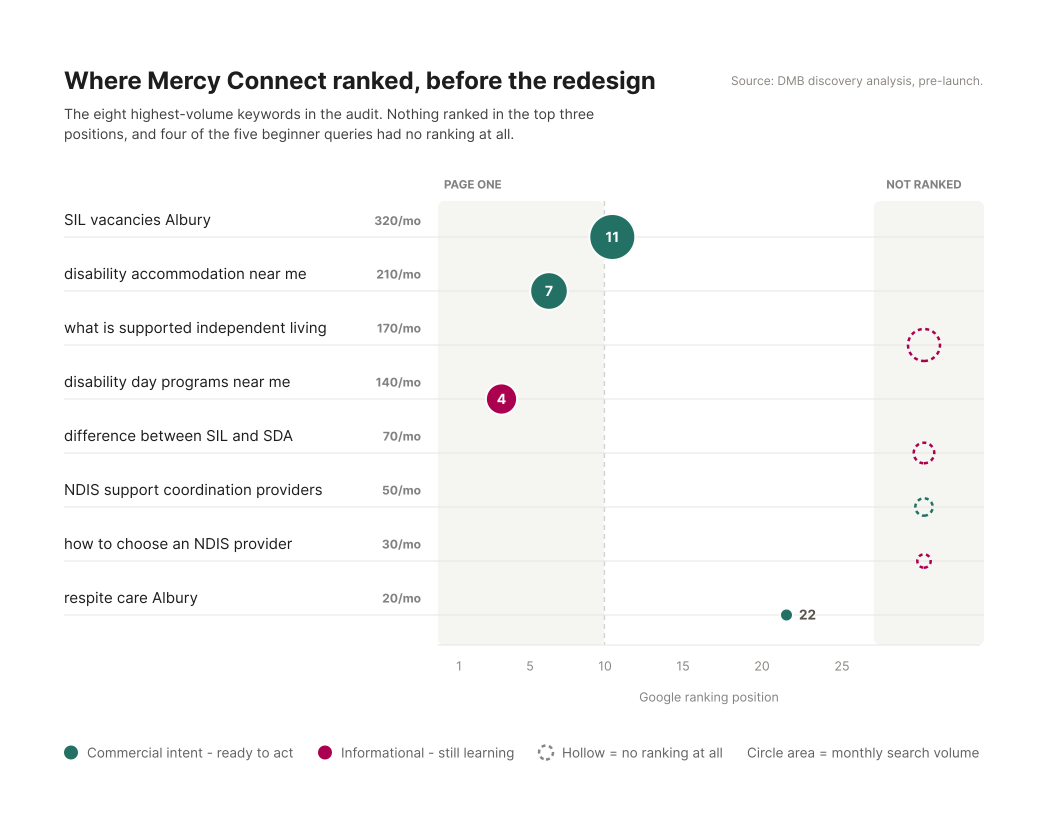
- The highest-volume commercial search term in the whole audit, “SIL vacancies Albury” at 320 a month, ranked eleventh — pointing at a page buried two clicks deep.
02
Solution
- Rebuilt the nav as an audience router, not a sitemap.
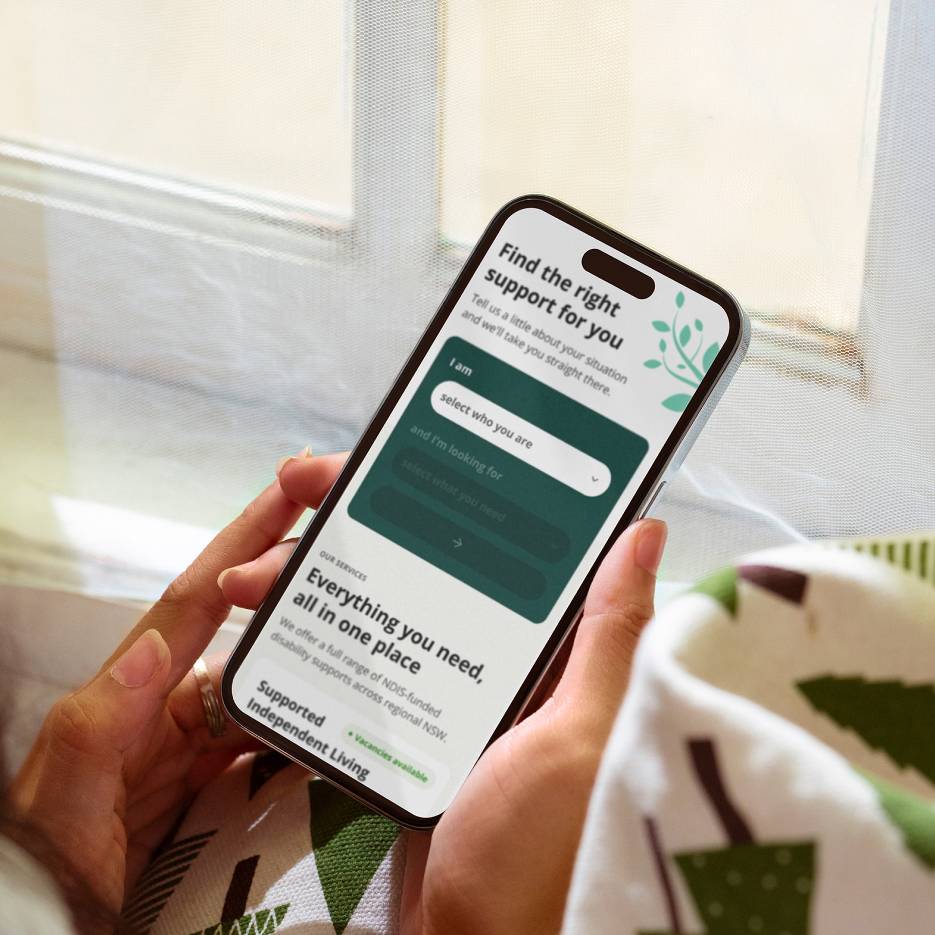
- Added a two-question intent widget for visitors no nav structure can place.
- Changed the teal at the source rather than bolting an accessibility widget on top of it.
- Replaced one contact form with three purpose-built conversion flows.
03
Shipped
- 28 page templates, live — including three multi-step flows running to 30+ screens.
- Vacancies from two clicks deep to zero — homepage section, dedicated page, and a live listing inside the nav dropdown.
- A brand teal clearing 5.80:1, up from 1.98:1, that now carries the entire interactive language of the site.
Outcome data still coming in.
SIL is Supported Independent Living, the NDIS funding category for long-term supported housing. Search terms are quoted exactly as they appeared in the audit.
Setting the scene
The site only worked for people who already knew the name.
Mercy Connect was getting roughly one enquiry a day across every channel, online and offline combined, and described its conversion rate as “not great.” SIL was the growth priority, with five or six vacancies to fill.
The search data showed where those enquiries were going instead. “SIL vacancies Albury” was pulling 320 searches a month, the strongest commercial term on the list, and the site sat eleventh for it. Position eleven is the first result on page two of Google. Meanwhile every informational query came back with no ranking at all: what is supported independent living (170/mo), difference between SIL and SDA (70/mo), how to choose an NDIS provider (30/mo). Those keywords weren’t ranked badly; they weren’t ranked at all, because the content didn’t exist.
That’s two failures pointing at two different people. Someone ready to act couldn’t find what they needed to act on. Anyone still working out what they needed had nothing written for them at all.
The other half of the problem never appeared in the brief. People arriving at the site are frightened and confused. Often they’re doing this for someone they love rather than themselves. A cold, clinical site confirms what they already suspect: that they’re on their own in this. That became the thing every screen got checked against — does it leave someone stranded, or walk them to the next step?
SDA is Specialist Disability Accommodation: purpose-built housing, funded separately to the support delivered inside it.
The constraint I couldn’t design around
A brand colour that fails the people the brand exists for.
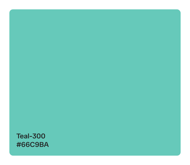
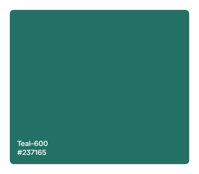
The brand teal (#66C9BA) was often used as a background with white text (#FFFFFF) over it, landing at 1.98:1. WCAG AA asks for 4.5:1 on body text and 3:1 on interface elements. This wasn’t a near miss on one threshold, as it failed all of them. For most organisations that’s a compliance footnote. For a provider whose users disproportionately live with visual impairment, it’s everything.
What made it worse was what sat on top of it. Every page carried a small teal accessibility-overlay icon in the corner, one of those bolt-on widgets promising alt-text and contrast adjustment on demand, while the site underneath still failed basic AA. That’s compliance theatre rather than a fix, and it’s why I treated the colour itself as the thing to solve.
How might we get four very different audiences to the right information without making anyone read a full sitemap first?
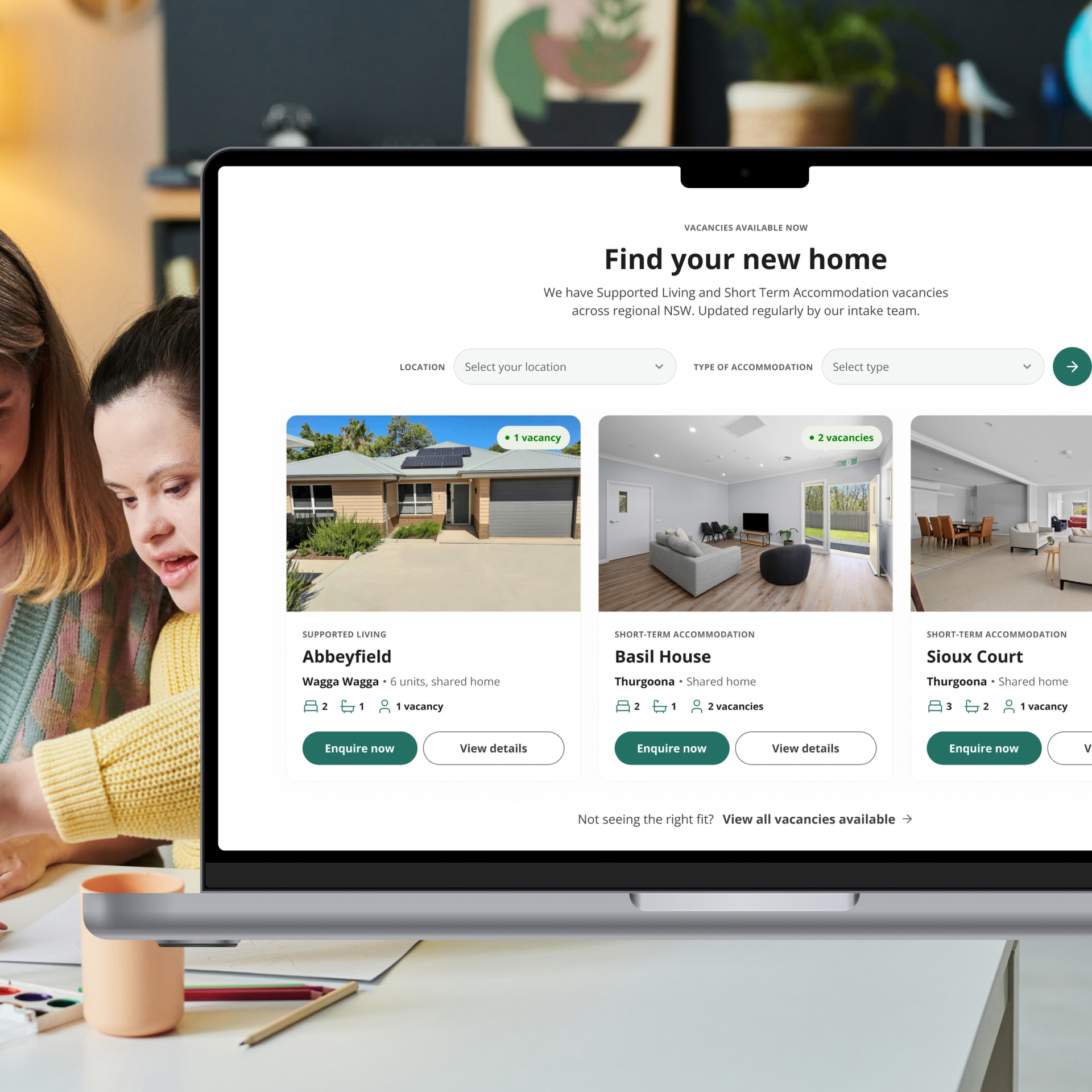
How might we make SIL vacancies feel as immediate and browsable as a real estate listing, without turning the homepage into a listings site?
How might we fix a colour that's basically the brand's DNA without making Mercy Connect look like a different company overnight?
These questions shaped every decision that followed.
My role
I led UX and UI end to end through Digital Marketer Bee on a four-person team. That meant discovery synthesis, the sitemap, every wireframe and high-fidelity screen across 28 page templates, and the scroll and motion direction across the whole site, all handed to our developer through annotated specs. The PM held the client relationship and the CX lead fed in what the intake team knew.
The rhythm was the same for every batch. Research, synthesis, at least three directions argued against each other, then wireframes for the one that held, then UI. After that I wrote the design notes — every decision and the reasoning under it — and walked the PM, the developer and the CX lead through them before anything reached the client. Their feedback went in first. The homepage went to build with annotations while I designed the next batch, so the developer was never waiting on me.
There wasn’t the budget or the timeline for user interviews. What I had instead was a discovery workshop with Mercy Connect’s Marketing and Communications Manager, a technical SEO and keyword audit, competitor benchmarking across Australian NDIS providers, and my own reading of how the system works, from SIL versus SDA to how respite funding is structured to how families search for this before they know the vocabulary. Validation happens after launch here, from the traffic team watching the live site rather than a test round before it. That was a real limit on the work, and I’d rather state it than let a workshop stand in for research it isn’t.
The thinking
The old nav was a sitemap. It had to become a router.
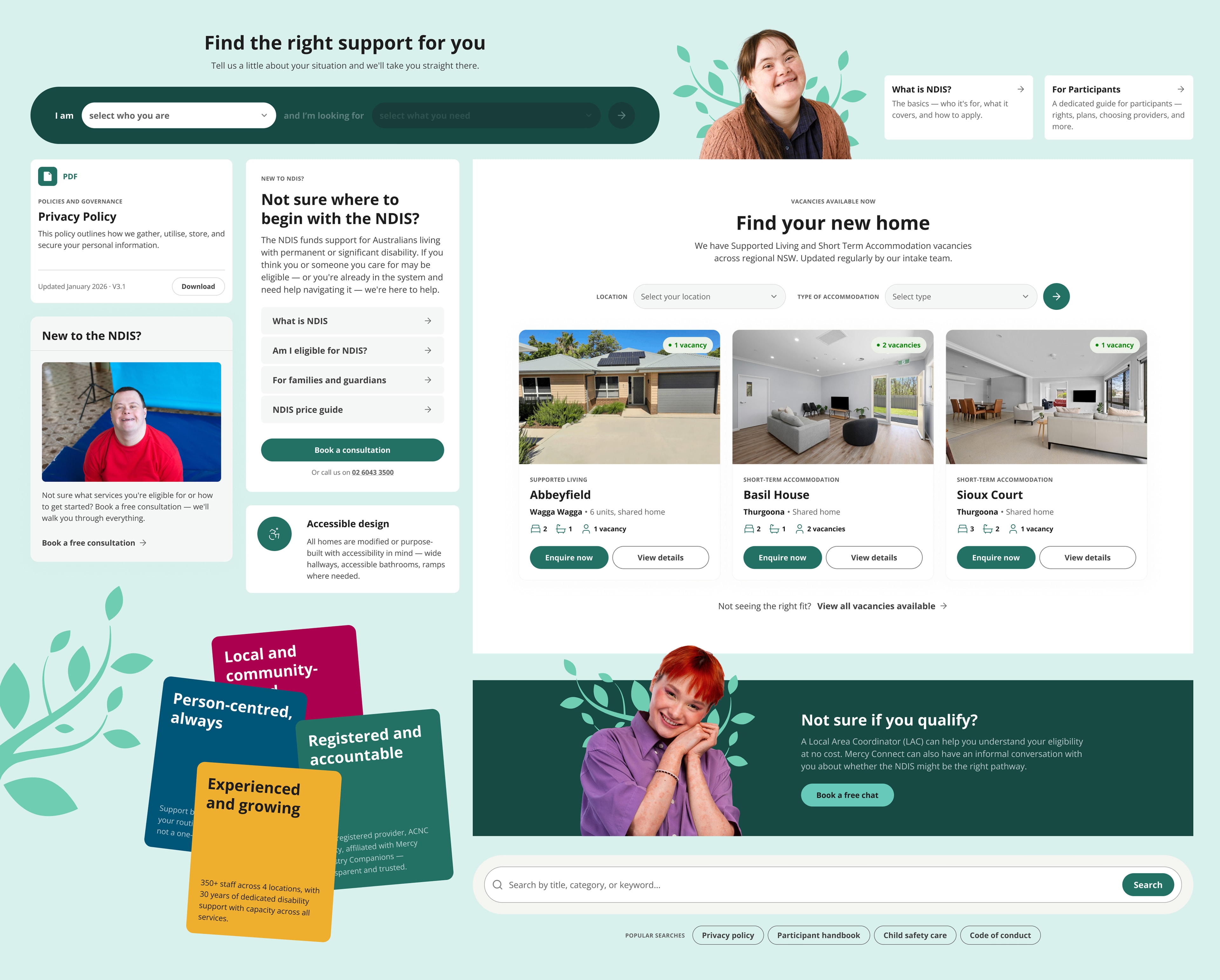
It had one flat tier, no descriptions, no phone number, no call to action, and Careers sitting at the same weight as Our Services on a site whose primary audience is families. I split it into two: a utility bar for secondary actions, and a main nav for discovery and conversion with a persistent Book a consultation button. The services got regrouped by need instead of by service name, each item carrying a plain-language descriptor so you don’t need NDIS terminology to know which column you’re in. Find a Home went further and pulls a live vacancy into the dropdown itself. Someone hunting for a SIL home sees a real property before they’ve clicked anything.
The homepage started as three competing structures, not one.
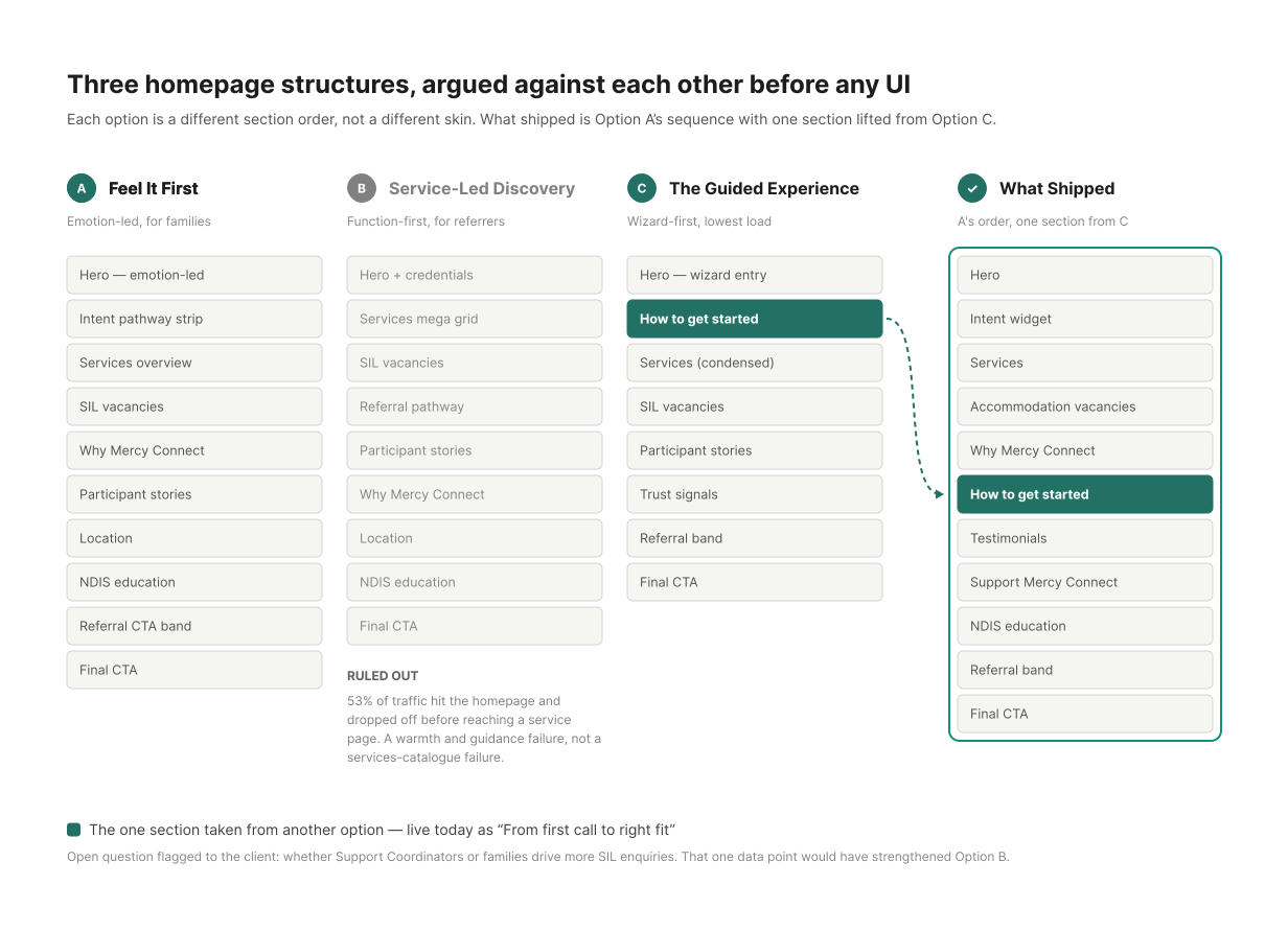
Before any high-fidelity work I wrote three section orders into a strategy doc and argued them against each other for the client: emotion-led, service-led, and wizard-first. The analytics ruled out service-led. 53% of traffic was landing on the homepage and dropping off before it reached a service page. That’s a warmth and guidance failure, not a catalogue one. What shipped is the emotion-led order with exactly one section lifted from the wizard-first option, a three-step explainer that demystifies the quiz before anyone reaches it, live now as “From first call to right fit.” I also wrote down what would have changed my mind: if referrers drove more SIL enquiries than families, the service-led case gets much stronger. Nobody had that number, so I flagged it rather than quietly picking my preference.
One section didn’t survive.
My wireframe had a Locations block and the live site doesn’t. Coverage varies by service, so the section would have had to state which services run where, and that detail wasn’t settled by the time the page had to be built. A section that says the wrong thing is worse than no section, so it came out. The support quiz still names the locations when it asks where you’re based, but that’s the only place on the site that does. It’s a gap I’d close once the coverage detail is settled.
Rebuilding the nav fixed wayfinding, but no nav tells a first-time visitor which of four audiences they’re in.
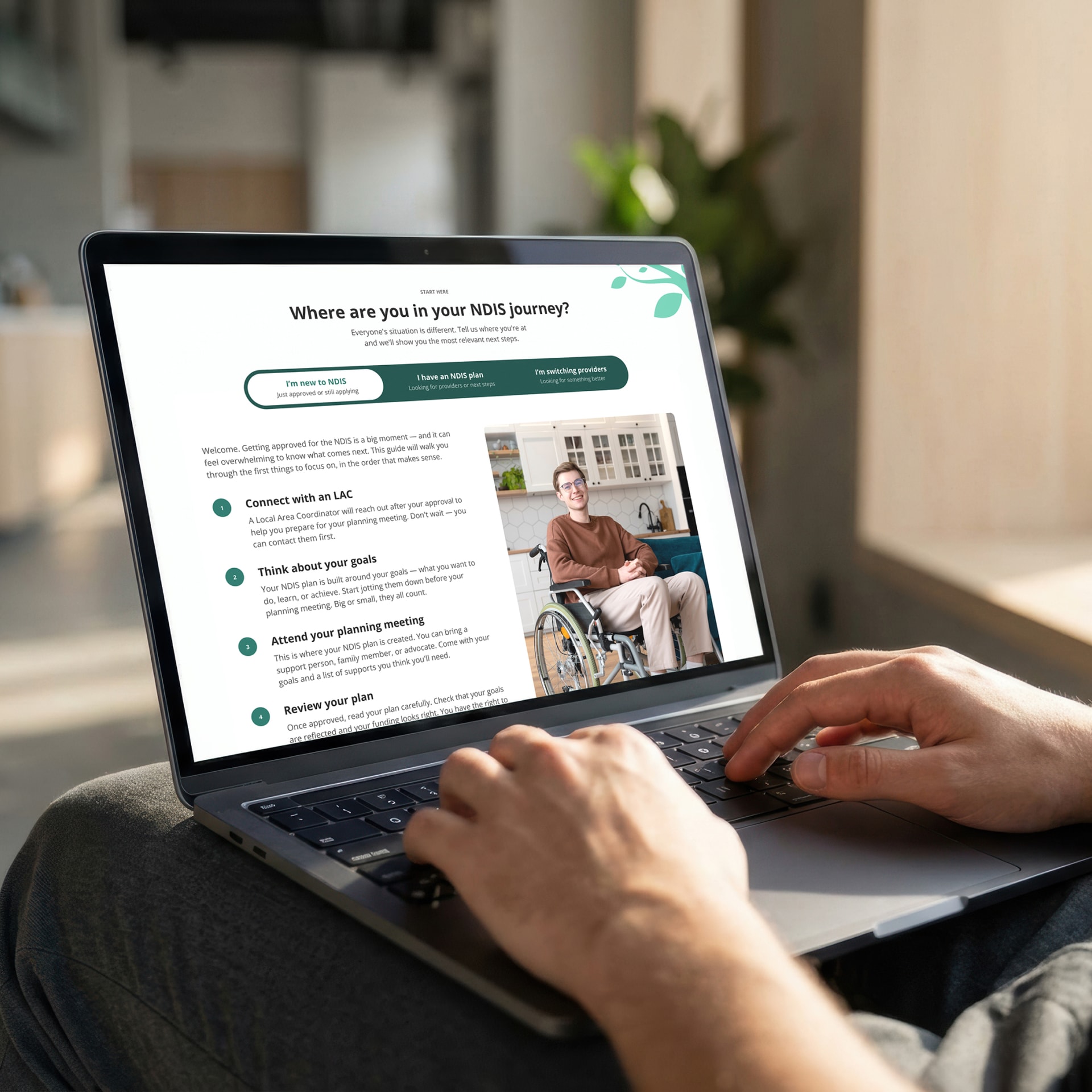
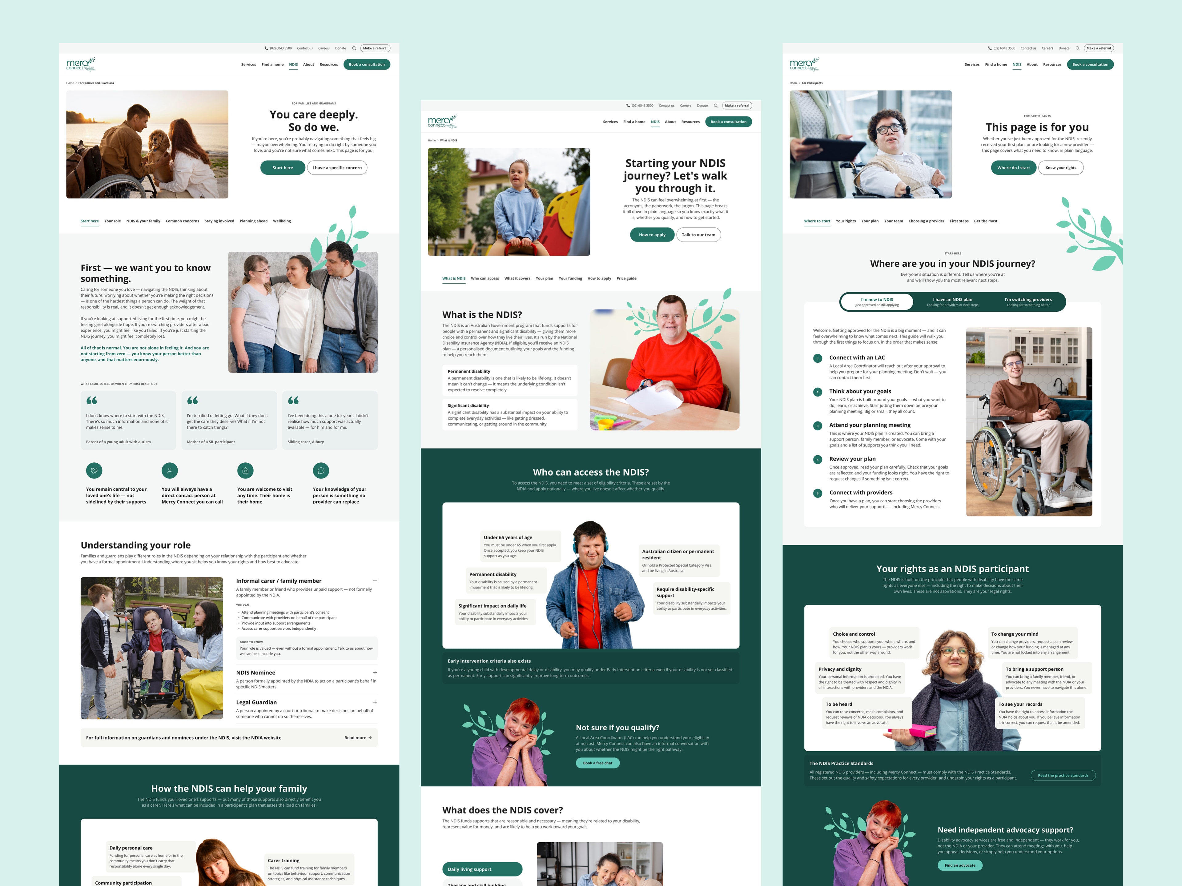
My first instinct was better labels. That solved for clarity and missed the actual problem. What shipped alongside the nav is a two-question widget under the hero, written as a sentence, not a form: I am ___ and I’m looking for ___. The second dropdown stays locked until the first is answered, and its options change based on it. Nobody gets one overwhelming list built for everybody. “New to NDIS” is a real path, not a footnote on someone else’s — it routes to what the NDIS is and how to apply, not to a services list they can’t interpret yet.
The queries with no ranking were the ones with no page.
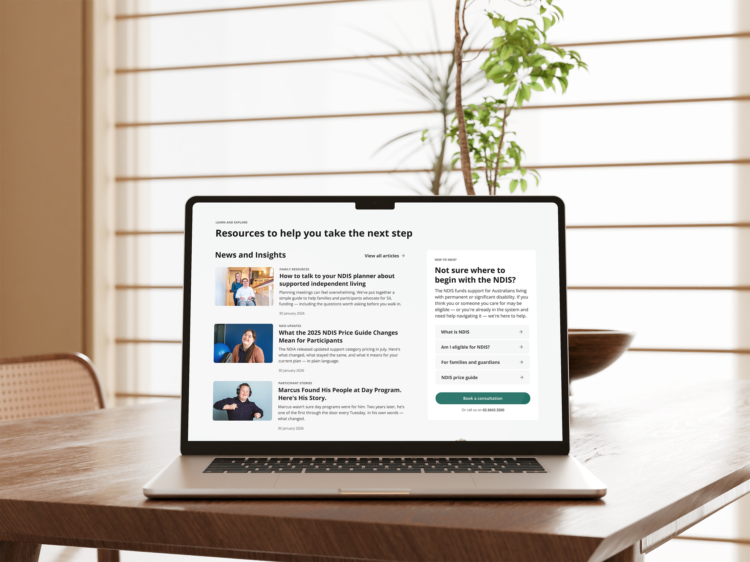
Every informational search came back unranked because nothing on the site answered it. So I built the answers: a Learn & Explore row on the homepage, and a full NDIS education hub behind it — What is NDIS, For Participants, For Families and Guardians. It changed the writing as much as the structure. People search in plain language, not NDIS terminology, so the copy follows them rather than the sector.
I used motion as hierarchy rather than decoration.
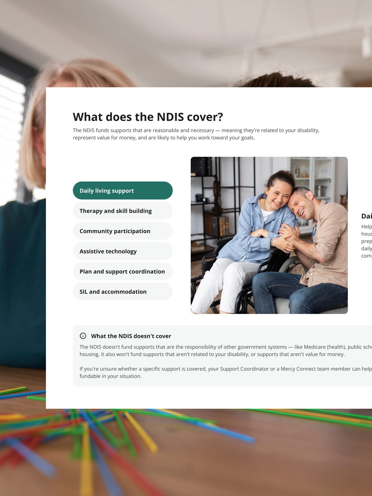
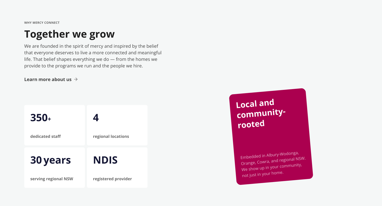
Eight services is too many for a static grid and too many for a wall of cards. The carousel reveals them progressively per scroll instead. The Why Mercy Connect section stacks four differentiator cards that appear one at a time against a fixed left column. That column is the anchor. Without it, the movement just reads as fidget. Each card lands with weight before the next one arrives. A four-item list becomes closer to an argument.
The teal had to change without the brand appearing to.
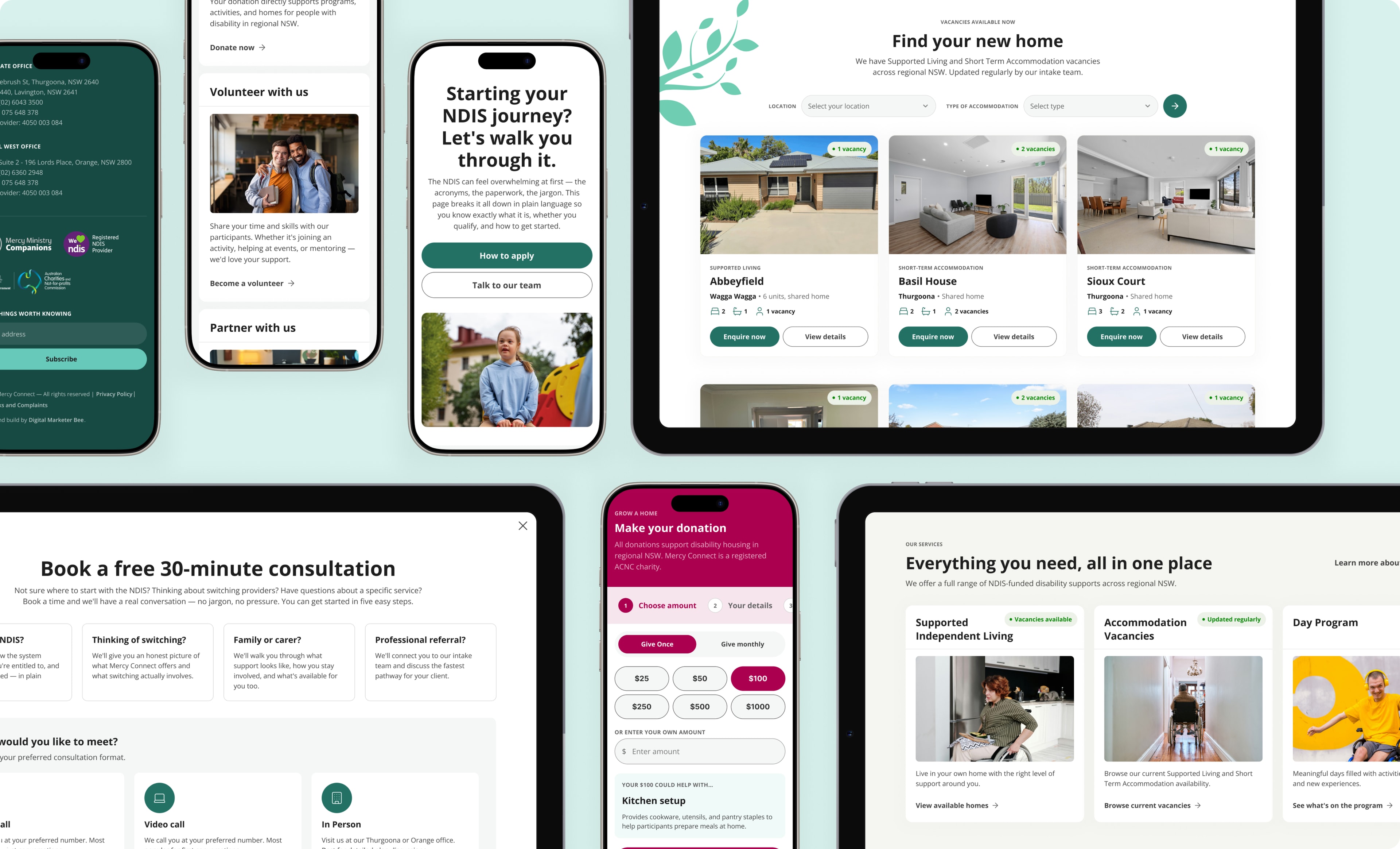
Darken it carelessly and it reads as “we changed your brand,” so I landed on #237165. It still reads as the same teal in daylight and on screen, and it clears 5.80:1 on white. AA on body text, large text and interface components alike. From there it became the interactive colour across the whole system. The original teal moved to accent use and to sitting on dark backgrounds where it’s safe. The fix bought two things at once: it cleared contrast, and it gave the site a consistent visual language for “things you can do” that the old one never had.
Three buttons were about to carry the entire commercial weight of the site.
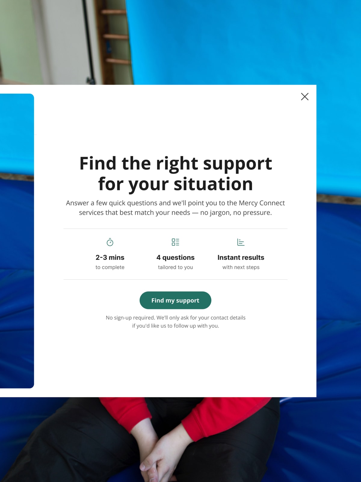
Every homepage section now points at Book a free consultation, Answer a few questions, or Make a referral. A generic form behind each one would have quietly undone everything the homepage was doing. Each action became its own flow instead. Three flows is a lot of scope for what was pitched as a homepage-led project. But a homepage doesn’t convert anyone. It hands them to the thing that does.
The support quiz had to know when to stop asking.
Two of its four questions branch out instead of continuing to the next. A professional referrer exits early to a screen pointing them to the referral form instead. Pushing a professional through participant-facing questions wastes the time of the audience least willing to spend it. Someone who says they’re new to the NDIS gets reassurance instead of a question they can’t answer yet. Location is asked last, deliberately, since it’s the most exclusionary question on the site and opening with it turns people away before they’ve got anything out of the exchange.
Testimonials use initials rather than photographs.
In disability services, participant photo consent is a real ethical and administrative problem, and a testimonial section that depends on it either stalls or puts quiet pressure on people. Four rotating quotes navigable by initial keep four distinct human voices on the page without making anyone’s face the price of admission.
The single accommodation page is the one I’d point to first.
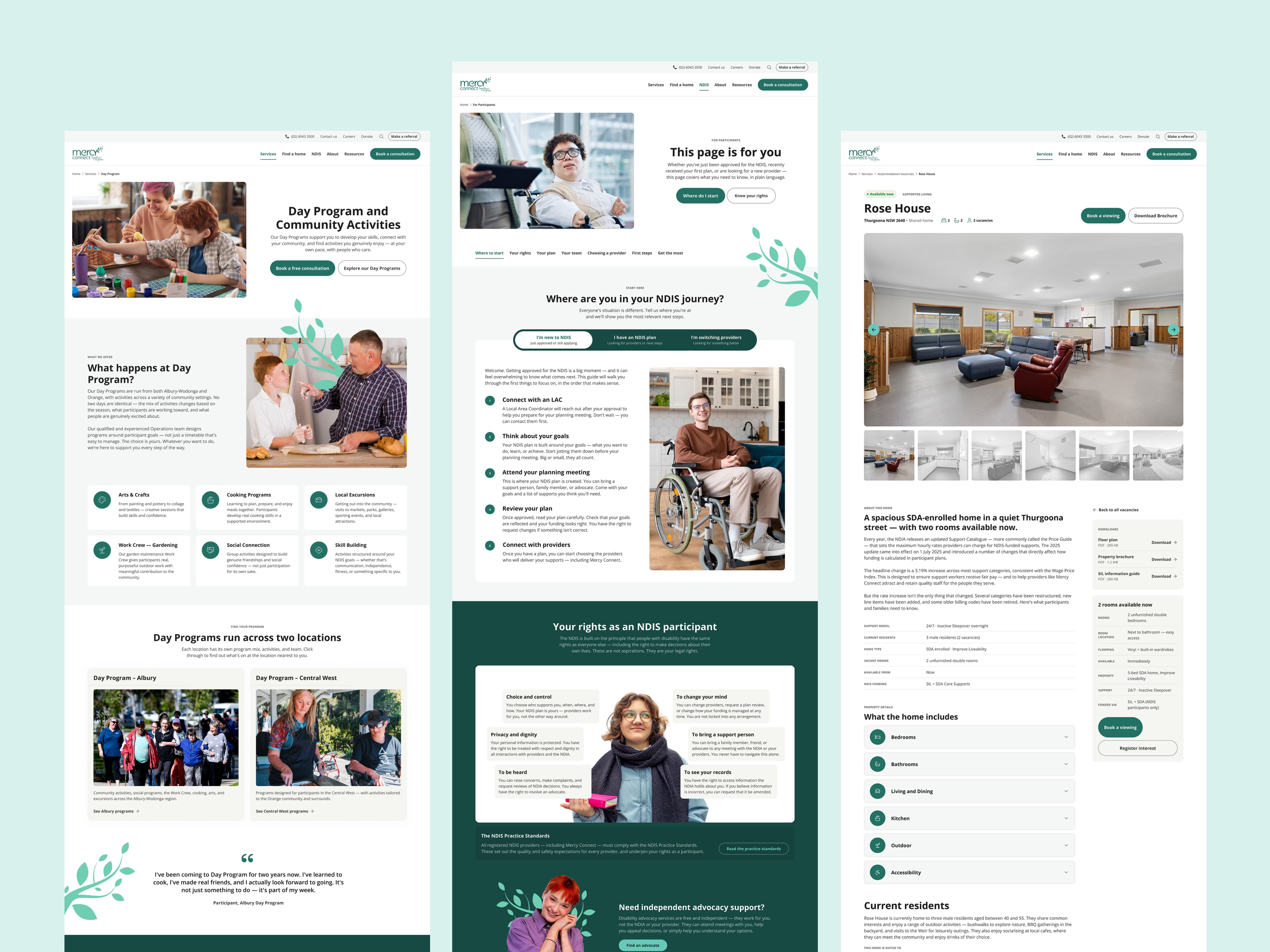
Vacancies were the highest-intent content on the old site and the most buried. A sticky sidebar holds the live vacancy count and a Book a Viewing CTA in view for the whole page. Feature categories sit in accordions so a wheelchair user jumps straight to Accessibility instead of reading past four sections to find it. And a short, respectful note on current residents answers the question no feature list can. Who would you be living with?
Gallery
The numbers I’m waiting on
The site has been live long enough to launch and not long enough to judge. A few of these are readable immediately, most need a quarter behind them, and I’d rather name what I’m tracking than stretch early numbers into conclusions they can’t carry.
Mobile and desktop performance against the 42 / 59 baseline
Enquiry volume against the old baseline of roughly one a day, split by channel — the split tells me whether the new tools are doing the work or the phone still is
Per-tool completion and drop-off, especially where people abandon the six-step referral form
Keyword position on “SIL vacancies Albury,” and on the informational queries the site ranked nowhere for
SIL vacancies filled since launch — the number closest to why the project was commissioned
Whether intake staff notice referrals arriving more complete and needing fewer follow-up calls
The question I’d most want answered: is anyone using the intent widget, or does everyone just scroll past it?
They took the time to understand our organisation, listened to our goals, and provided valuable advice throughout the project… The end result is a modern, user-friendly website that reflects our brand and better supports the people we serve.
Praise for the agency rather than for me specifically, but the last line is the outcome I was designing for.
Learnings
Search data can do the job of an interview, if you actually listen to it.
The keyword audit told me something a workshop never could: most visitors arrive confused, not informed. It said so more honestly than an interview would have, because nobody’s performing for a moderator. It also gave me a better argument. “Write it plainly” is my opinion. “The highest-volume queries are the ones we rank nowhere for” is their data.
Flag scope changes the moment you make them, even when you’re confident they’re right.
The support quiz wasn’t in the original scope. I added it because the intent widget’s logic only existed on the homepage, and every other entry point had nothing to route through. I was right about the need and wrong about the process. What I’d do differently is put it to the client as a choice up front rather than presenting it built.
A thesis needs protecting, not just stating.
Nobody using this site has to feel like they’re figuring it out alone. That held across 28 page templates and three flows. It’s easy to say in a workshop and hard to hold through months of wireframes and stakeholder rounds. The pressure is never one decision that breaks it. It’s twenty small ones that each seem fine on their own.