Hospitality · Entertainment · B2C · Responsive web
SS&A Club: rebuilding an 80-year-old institution for the customers it wasn’t counting
Role
- UX, UI, information architecture, interaction direction
Status
- Live — ssaclub.com.au · 2025
Visit SS&A Club website Context
- SS&A Club — Albury, NSW
for Digital Marketer Bee Tools
 Figma and FigJam
 Claude
 Google Docs
Ask anyone who grew up in Albury and they’ll have their own SS&A story — be it a wedding reception, a Friday night raffle, a regular seat at the bar where staff know their name before they sit down, or a free concert where the singer is belting their heart out. SS&A has been doing this for eighty years, with 34,000 people signed up as members.
On paper, the website covered everything: nine items in the top navigation — restaurants, bars, functions, community, membership, the whole lot. Every part of the club was represented somewhere. Nothing was missing, exactly. It just couldn’t be found: the events that drove more revenue than any other entry point had no page of their own and no search presence at all.
In the discovery workshop, the business told me who their customers were, and the floor staff told me a different thing. Both had evidence, and that was the moment the brief stopped being a redesign.
I rebuilt the site around intent with seven destinations named after what a person came to do, every page working backwards from a single action, and gaming — a revenue pillar we legally could not advertise — reframed around what we could show instead.
01
Problem
- The site was organised around the org chart, not the visit.
- Events — the highest-revenue entry point once people engaged — had no landing pages and no search presence.
- Six function rooms couldn’t be compared.
- One of four revenue pillars was illegal to advertise.
02
Solution
- Rebuilt the site around intent instead of departments.
- Seven goal-named destinations, every page built backwards from one action.
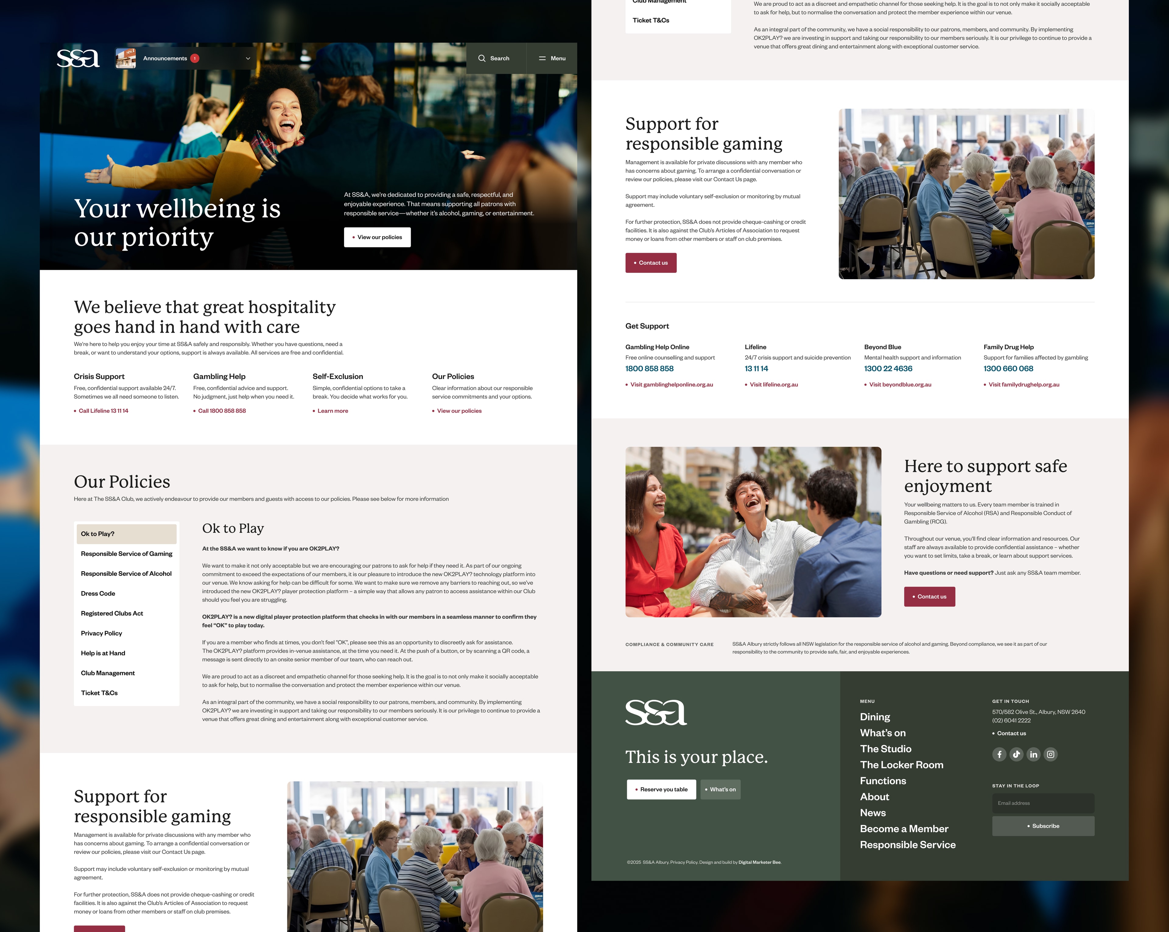
- Gaming reframed around what could legally be shown — with a Responsible Service page giving the reframe something real behind it.
03
Shipped
- 23 page designs, live — and a nav that went from nine top-level items to seven.
- One template across six function rooms — comparison without a redesign per room.
- Inline ticketing — one indexable page per event, with the transaction on it.
Post-launch performance data still being gathered.
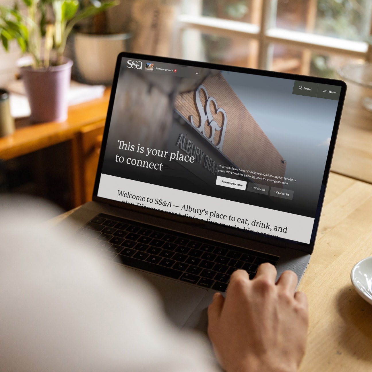
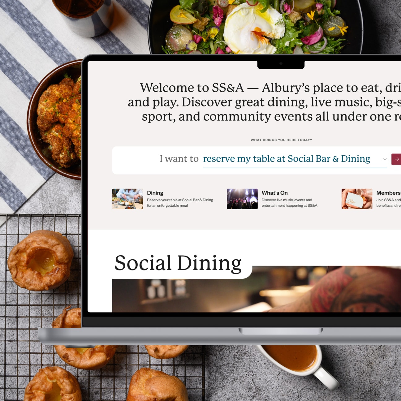
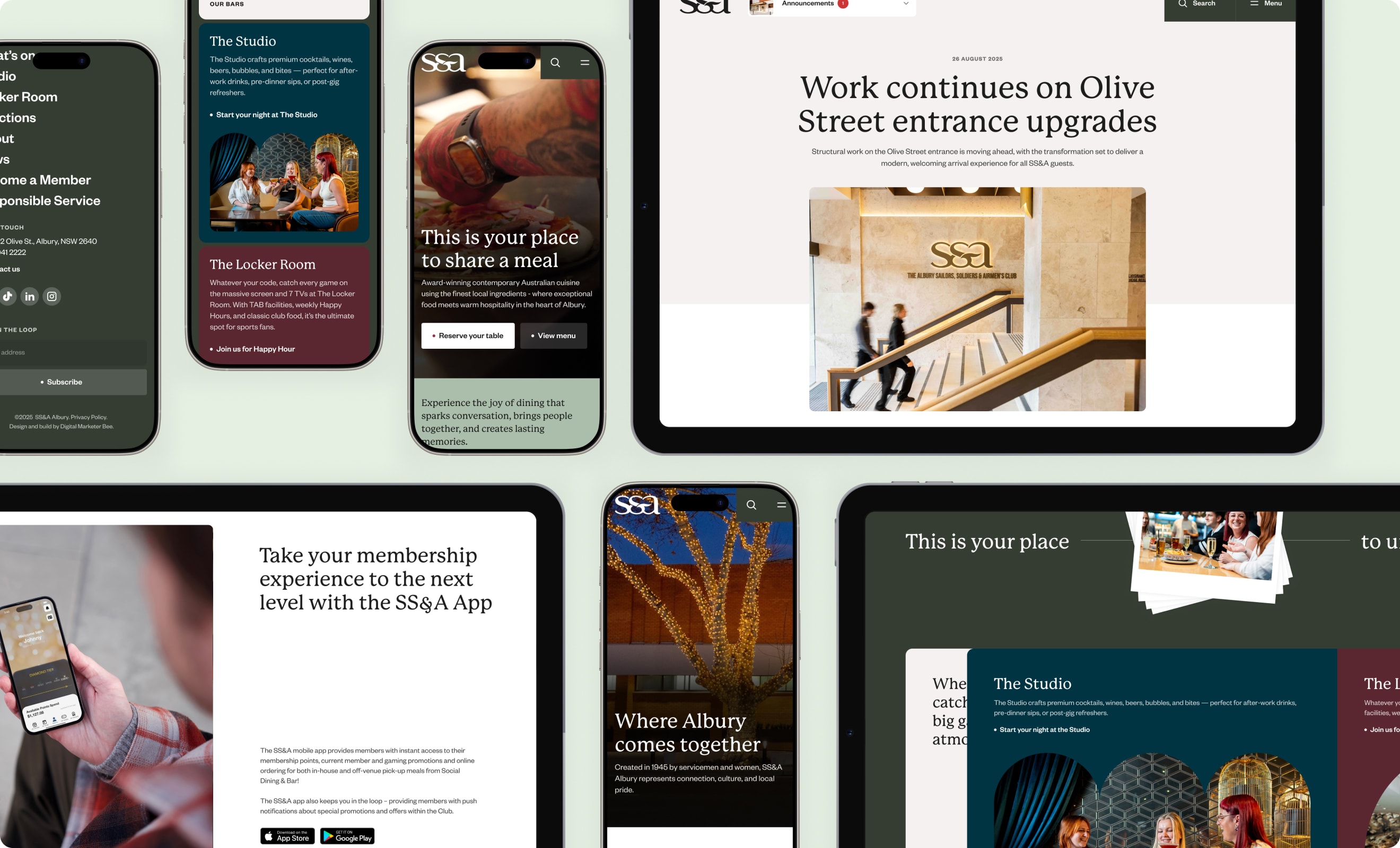
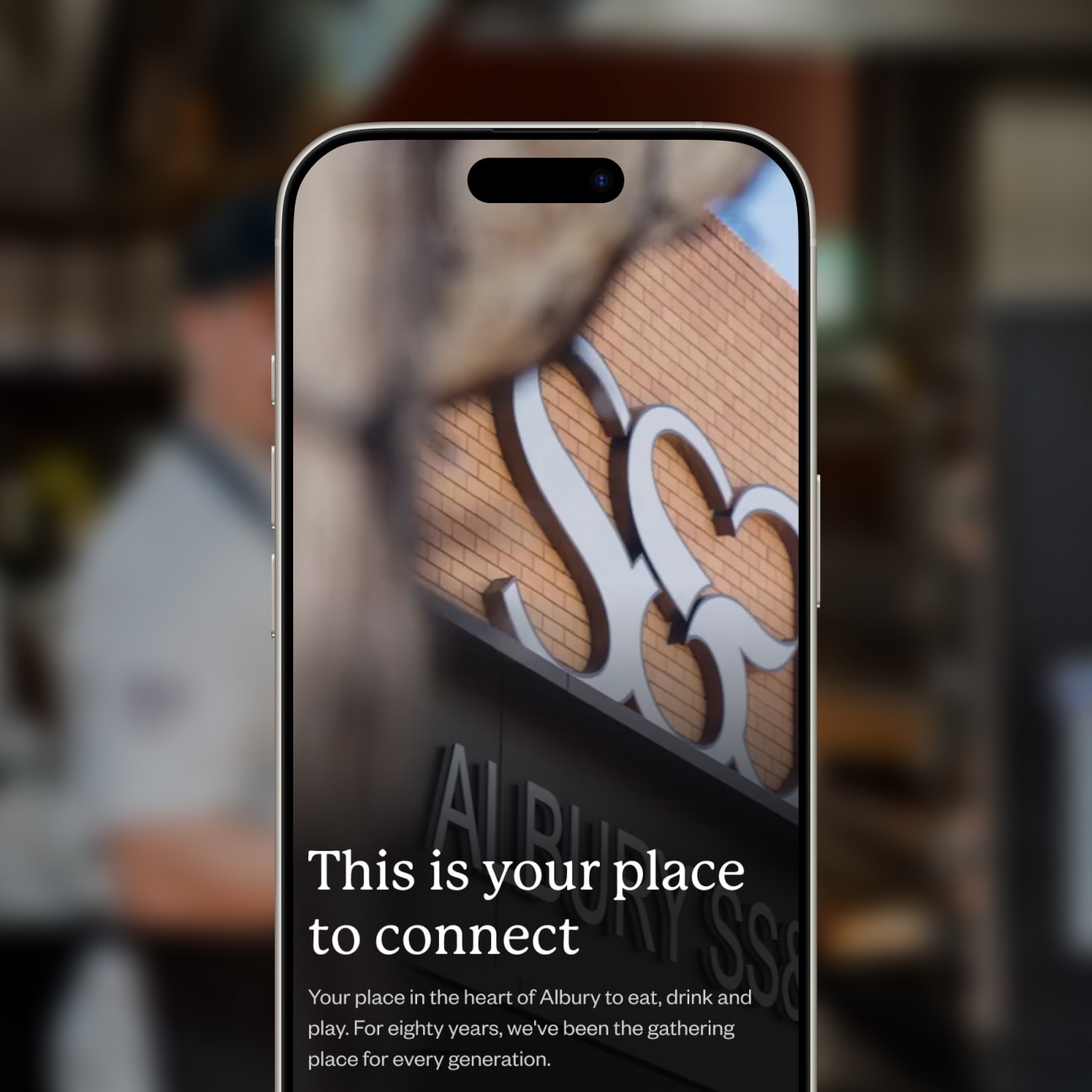

Setting the scene
Nobody had been steering the channel. Digital had been treated as an unknown and largely left alone, with no strategy behind it, no SEO work and no tracking to show what was or wasn’t happening. The business wasn’t struggling because of its website. It was struggling because it wasn’t showing up where its customers were looking online. The missing rankings, the absent analytics and the invisible events were symptoms of the same thing.
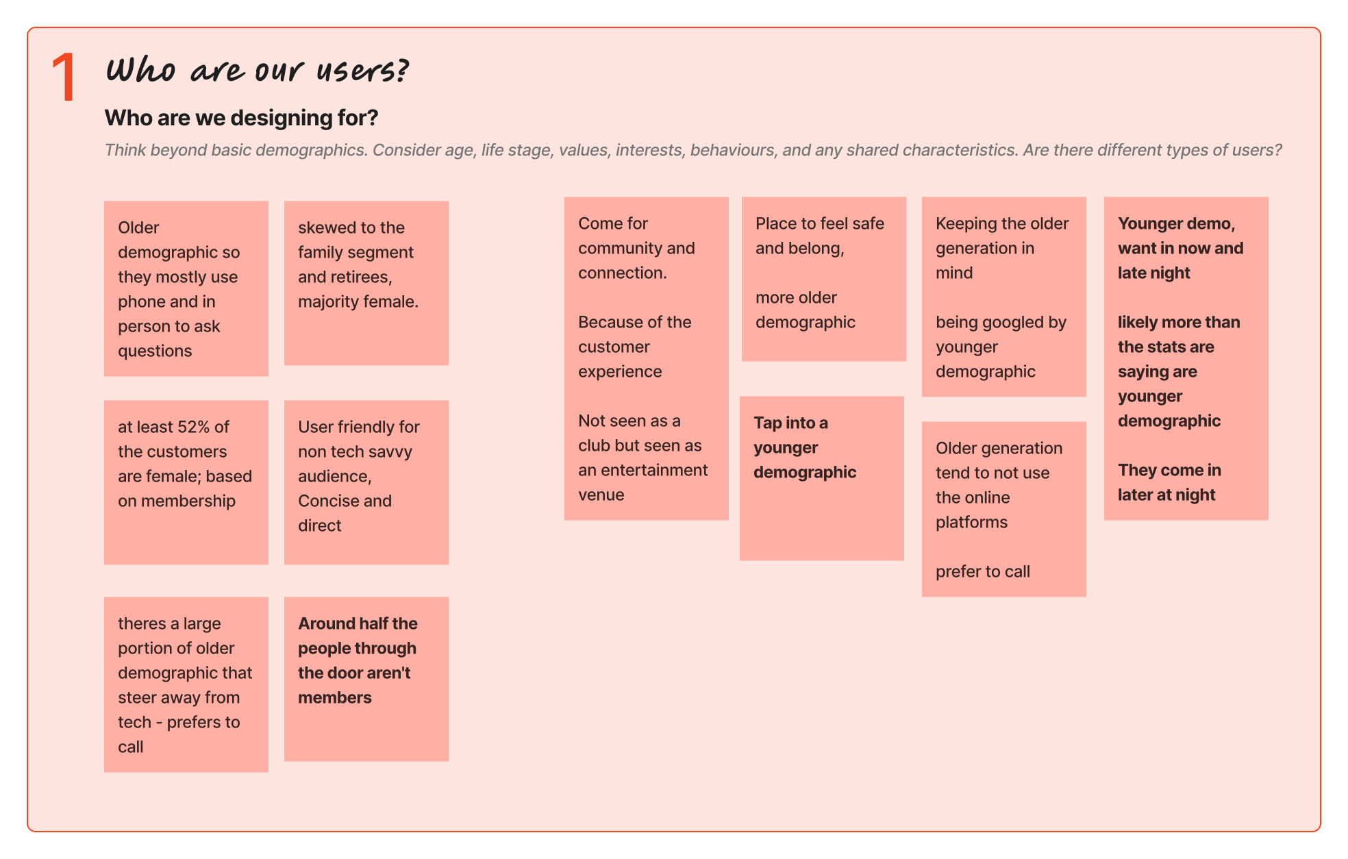
The data and the floor staff also disagreed. Membership analytics described a settled, older audience — weighted to a family segment in their mid-30s to mid-50s, with retirees close behind, and a majority female. Take that into consideration and you’d get a careful, conservative site.
Meanwhile, staff who work the floor at 11pm said the numbers were quite different for them. Around half the people through the door aren’t members at all, and the younger crowd was never counted because they don’t sign up. One note from the workshop board: “likely more than the stats are saying are younger demographic. They come in later at night.”
Neither of them was lying. The data described the members; staff were describing the customers. Around half the customers never show up in the membership data.
The brand had also moved without the site. SS&A had been through a brand refresh with Kindred Creative, and the website hadn’t caught up with it. Look and feel, speed, security, a usable backend and mobile-first delivery all sat together on the success board — a fair measure of how much ground there was to make up.
Likely more than the stats are saying are younger demographic. They come in later at night.
The constraint I couldn’t design around
You can’t advertise pokies in NSW, but you also can’t pretend they’re not there.
NSW law prohibits advertising poker machines to the general public. This means no promotion, no implied reference and no getting clever. Gaming is one of four revenue pillars, and the whole of it was off-limits.
Our workshop revealed what staff hear from customers: that the club can read as a pokies venue first, and that there is nowhere to get away from it. This wasn’t only a legal problem — part of the audience actively held it against the venue.
Hiding it wasn’t an option either, because people search for bingo and TAB, and a club this size has a duty of care it should be visible about.
How might we structure a four-pillar venue so every visitor finds their reason to stay, without the site reading like a department directory?
How might we serve an older, phone-preferring audience and a younger, mobile-first one on the same pages?
How might we represent a revenue pillar we legally can't promote — and that part of the audience resents — without pretending it isn't there?
These questions shaped every decision that followed.
My role
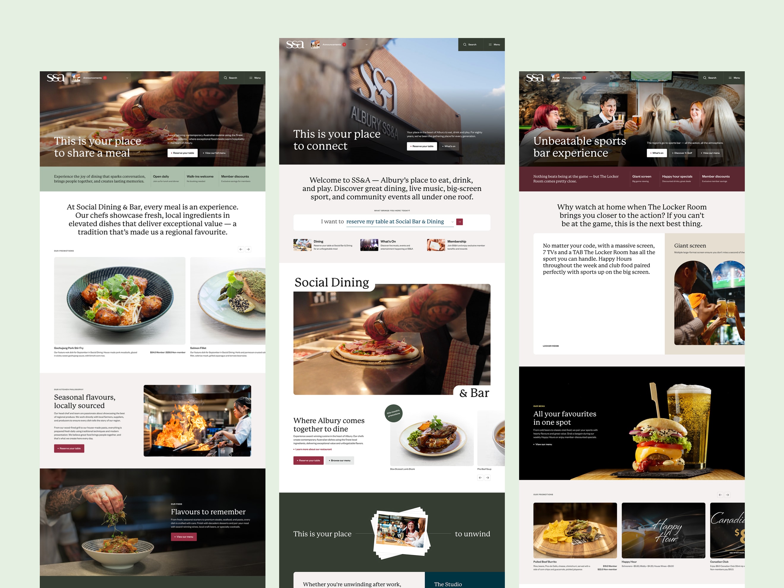
I led UX and UI end to end through Digital Marketer Bee, in a team of four. I designed the workshop format and wrote the questions for every session; in the room, the CX lead ran the business-facing sessions, and I ran the brand and visual direction. From there it was mine — sitemap, wireframes, UI, and the scroll and interaction direction across every page, handed to our dev partner through annotated specs. Every page on the site is my design.
Fast agency timelines meant no budget for user interviews. Decisions were grounded in the workshop with staff who serve these customers daily, our traffic team’s search and ranking research, membership analytics, the eight-venue competitor audit, the NSW gaming rules read first-hand, and a heuristic pass over the old site. User validation happened after launch, not before. I’d rather say that plainly than dress a workshop up as research it wasn’t.
The thinking
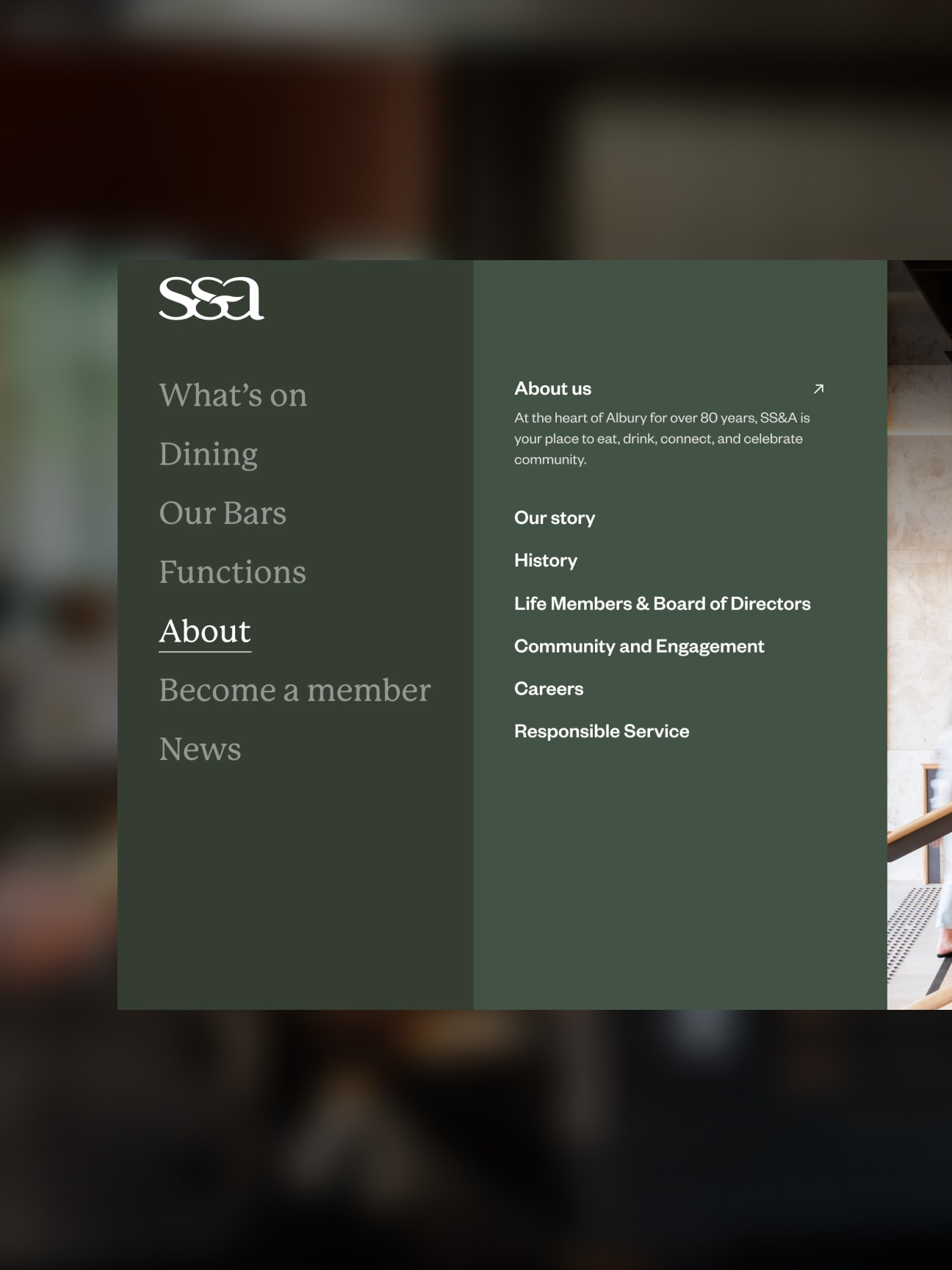
The old nav had nine top-level items, which gave compliance pages the same priority as the ones that made money.
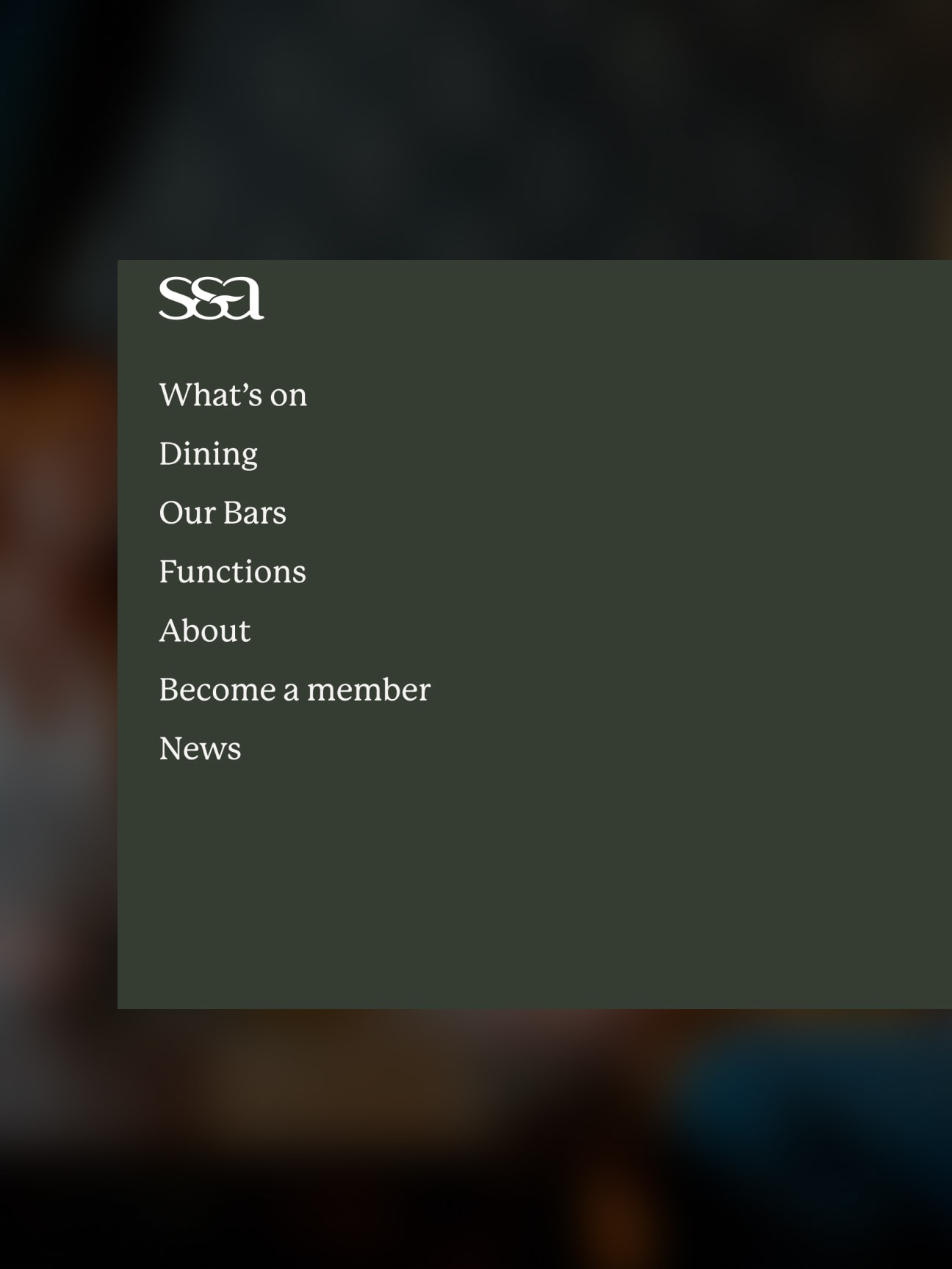
I reduced it to seven destinations based on user intent, making key experiences like bars, functions and events easier to discover. “Restaurants” became “Dining” in that pass — one names a department, the other names what you came to do. The menu opens as a full-screen panel where each destination expands into its sub-pages with a line of context. Responsible Service moved into the section it belongs to, where people can still find it without it competing for attention at the top level.
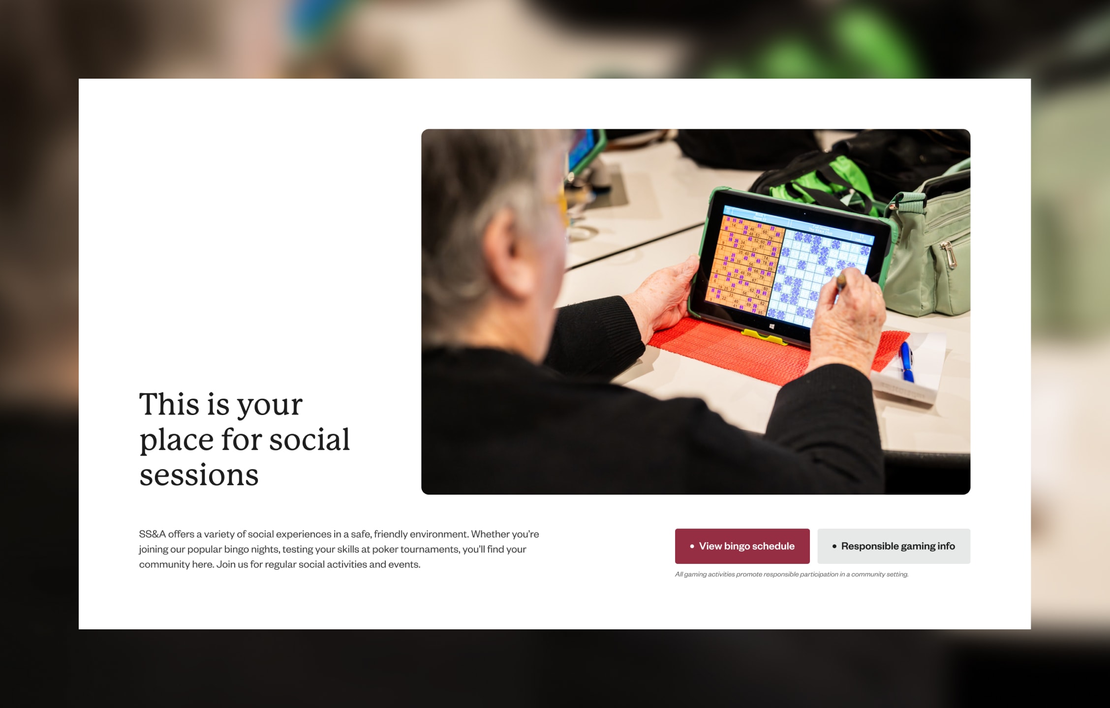
“This is your place” was the brand line. I made it something each visitor finishes for themselves.
Kindred Creative’s positioning work gave the club the phrase; my decision was to let every section complete it with a feeling or a favourite thing to do, rather than repeat it as a slogan. This is your place to share a meal · to unwind · for social sessions · to belong. Someone coming in for bingo and someone booking a night out finish the same sentence differently — which is how one line reaches two audiences that barely overlap.
Homepage structure is the most expensive thing on a site to get wrong, so I treated it as a hypothesis and built two.
A conversion-first layout ordered by revenue priority, and a narrative “visit” sequence that follows a night out. Client review at the agency happens once there’s UI to look at, so wireframe stage was where this had to be resolved. I argued each direction against the other and wrote the trade-off down: the narrative version favours first-timers and brand differentiation, the conversion-first version favours returning users and task-focused mobile behaviour. What shipped is a hybrid — the journey sequencing of one, the conversion logic of the other.
“What’s On” started at the very bottom of my first wireframe — the default spot for an events listing, and the wrong one for a section that drives revenue. So I moved it up.
Events sell tickets and the food and drinks around them, but frequency beats ticket value — every visit involves food and drink; not every visit involves a show. What’s On landed third, after dining and bars.
The homepage never made a case for the club itself, so I added one to build trust.
The old site sold offerings and never sold SS&A, and a business converting non-members needs the trust case to land before the ask. My first wireframe gave it two blocks doing the same emotional job, so I merged them into “Your story is our story” — one beat, with 80 years and 34,000+ members revealed on scroll.
I couldn’t promote gaming, so I built the category out of what the prohibition doesn’t reach.
Reading the rules first-hand rather than in summary, the restriction is specific: it covers advertising the playing of gaming machines. Bingo, TAB and poker tournaments aren’t gaming machines — so the whole section could be built from things the prohibition was never about, with responsible gambling messaging alongside. The softer options that gestured at pokies without naming them were cut.
The wording for this section kept tightening all the way to launch: my wireframe said “Social Gaming & Activities”, the UI narrowed it to “social gaming”, and what’s live reads This is your place for social sessions. The category never moved; every review pass just took another step back from the word.
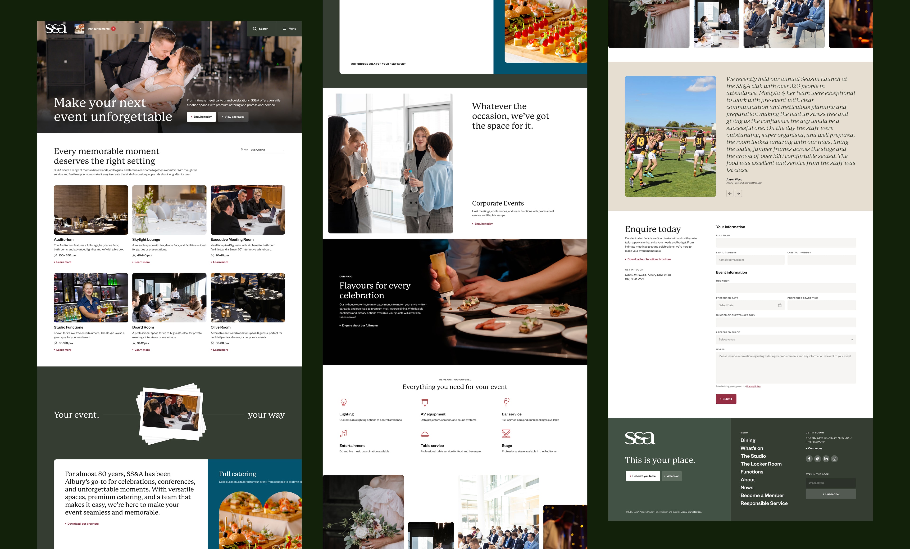
Six function rooms, one template, so they can be compared.
Someone choosing a venue compares far more than they read, and comparison only works when the pattern holds still — same structure every time, with the emphasis shifting per room. Users learn it once and move through five rooms in the time a bespoke layout takes to parse. New rooms drop in later without a redesign.
The gap between “I’m interested” and “I’ve paid” is where event sites lose people.
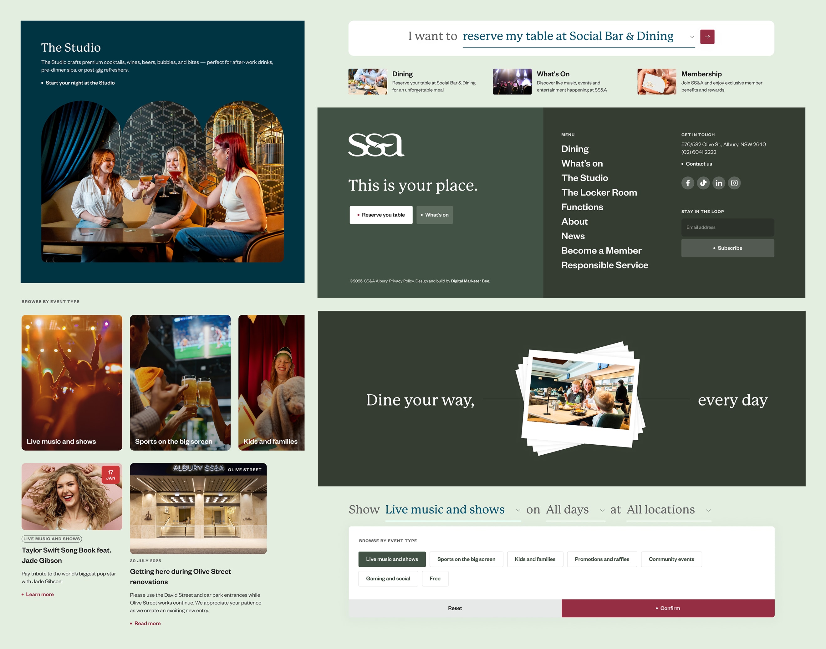
SS&A runs its ticketing through Eventbrite, so rather than send people to a third-party domain mid-purchase, the checkout is embedded on the SS&A event page itself, with a quantity selector and order summary in place. It fixed the SEO gap in the same move: one indexable event page on SS&A’s own domain, with the transaction on it.
The renovation already had a nav item — what it didn’t have was a reason to visit.
I rebuilt “Renovation News” from an announcement dump into a channel with a hub and progress pages, so the disruption reads as investment rather than apology. Each update closes on a “Still open, still amazing” block rotating through the venues that are still trading.
Gallery
Nine months in
The old site had no analytics or tag setup worth the name — one of the things the workshop turned up. The new one is measured, so for the first time there’s something to read.
What the traffic shows.
Just over 50,000 users and around 95,000 sessions between launch in late November 2025 and August 2026, with close to 33,000 clicks from search. After a launch-and-Christmas peak, traffic settled into a band of roughly 6,100–6,800 users a month and has stayed there for six months. July 2026 was the strongest non-festive month on record.
Two numbers worth pointing at.
About one in ten search impressions turns into a click. That’s high, though a good share of it is people searching for SS&A by name — so it measures how well the site holds people already looking for the club, not how well it wins new ones. And 1.87 sessions per user: people come back. That’s the closest thing here to evidence that What’s On is doing its job, since it’s the page you’d check again and again.
What it still can’t tell me.
There’s no conversion tracking, so dining reservations, function enquiries, ticket sales and membership sign-ups are all invisible. There’s no traffic-source split, so organic can’t be separated from direct or social. And there’s no audience data — which means the thing this entire project turned on, whether the site reaches a 24–35 crowd without losing the older members, is still unanswered.
The question I’d most want answered: did the two-audience approach actually hold, or did one of them quietly win?
Learnings
A constraint you can’t design around will tell you what to design instead.
The pokies restriction looked like the hardest limitation in the brief and produced the most distinctive part of the site — being unable to sell gaming forced a community framing a promotional approach would never have found.
When the data and the floor staff disagree, neither is lying — check what each one counts.
The membership numbers weren’t wrong, they were answering a narrower question than the one I was asking, and finding that gap is what turned a single-audience brief into a two-audience site.
With no research budget, buy certainty somewhere else.
No interviews meant leaning harder on what I could get — staff who watch these customers daily, eight competitors audited properly, and a structural decision I argued both sides of before committing to either. That last one cost a day and saved a rebuild.