Social · B2C · Mobile app
Twitter bookmarks optimisation: redesigning a save feature that had no retrieve
Role
- Product Designer
Status
- Concept · Mid-fi prototype
(V1 + V2) · 2021 Context
- Personal project
RMIT Online UX Short Course Tools
 Figma and FigJam
 Zoom
Zoom Google Docs
I read alternate universe stories on Twitter – fan fiction that unfolds thread by thread, updating over weeks. I’d bookmark the latest instalment as a placeholder: come back here, this is where you left off. But I was bookmarking everything else too – articles, replies I owed people, things that made me laugh.
Within months I’d lost my place in half a dozen stories.
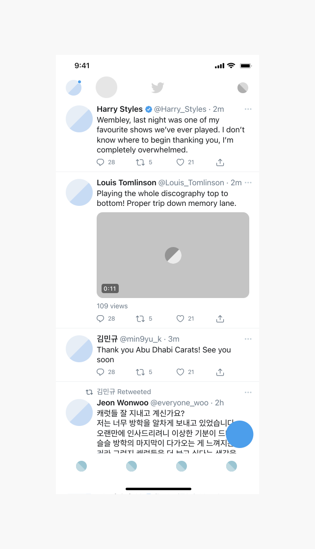
On paper, Bookmarks worked. Tap the icon, save the tweet, come back later. In practice there was no search, no folders, no filters, and no dedicated bookmark icon – you saved a tweet through the share menu, a path most people never found.
The problem became obvious the day I went looking for one specific update and gave up. The feature could store anything and retrieve nothing.
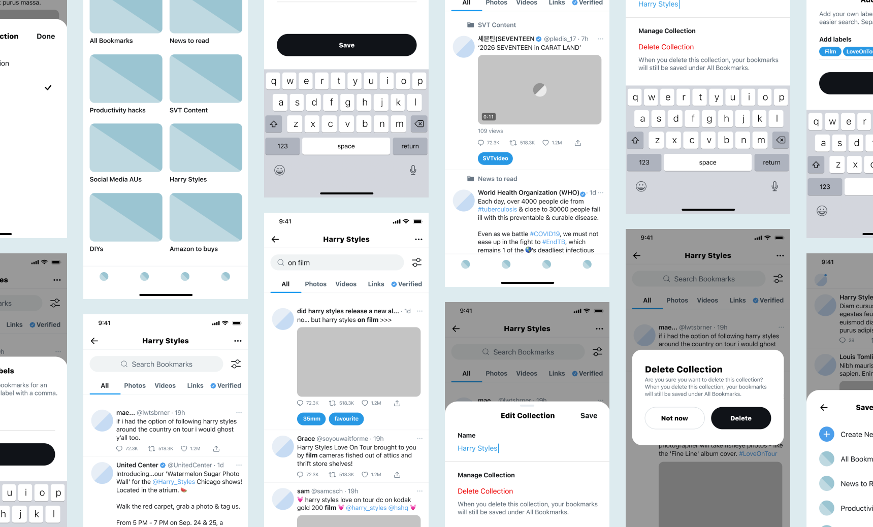
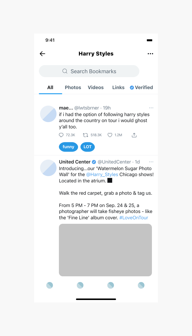
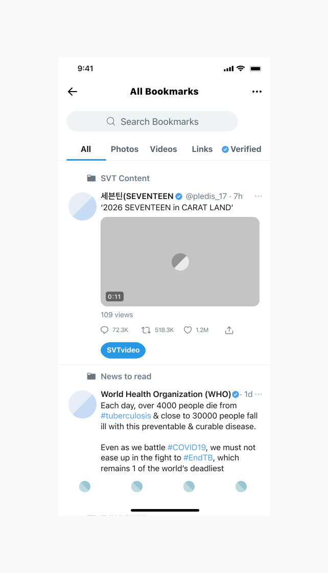
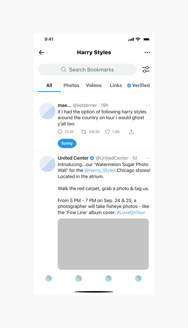
I redesigned Bookmarks around getting things back out. Collections you create as you save, search and filtering inside each collection, and private labels for the things only you would think to search for.
01
Problem
02
Solution
03
Results
Five revisions from V1 to V2, each one traced to something a tester did rather than said.
93% task completion across six activities.
Direction later validated — X shipped bookmark folders and search in 2023.
Setting the scene
It wasn’t just me.
Before designing anything, I sent four yes/no questions to seven Twitter users to check whether this was a personal annoyance or a real gap.
Five of seven found Bookmarks hard to navigate. All seven said finding a specific saved tweet took real time. All seven wanted a way to organise them. And four of seven said they accidentally unbookmarked tweets — the one interaction the feature did have was failing them too.
A landscape review told me what not to copy. Instagram, Facebook and Pinterest all let you save into collections, and none of them offer search inside saved content. That’s fine for Pinterest, where saving is a curation act. It’s wrong for Twitter, where saving is a reflex you perform mid-scroll. Collections on their own would have rebuilt the same gap in a nicer wrapper.
I also found Dewey during the review — a Chrome extension that exists purely to import Twitter bookmarks and sort them into collections. An entire third-party product had grown in the space Twitter left empty.
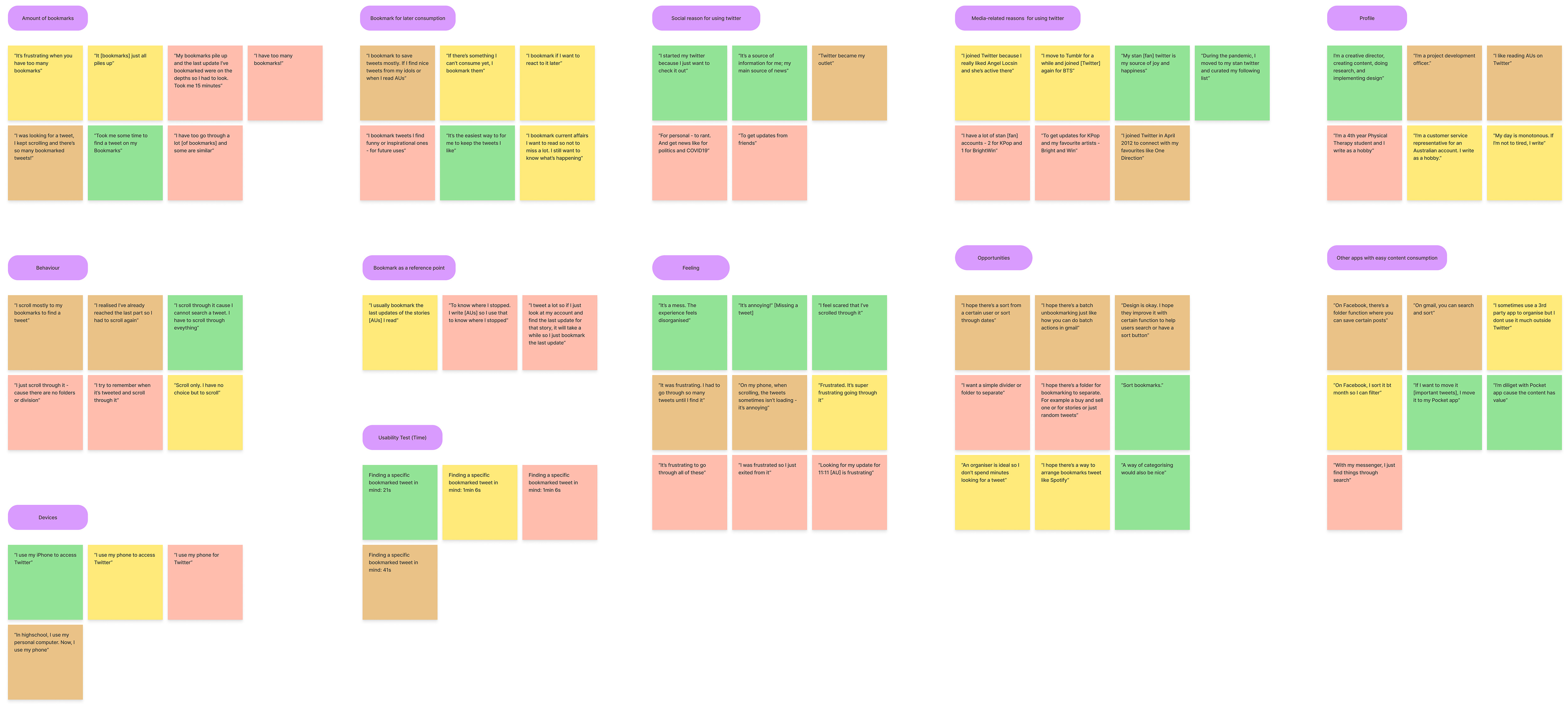
Four user interviews made it emotional rather than practical. The affinity map is full of feeling: “It’s a mess.” “It’s annoying!” “I feel scared that I’ve scrolled through it” — scared of having already passed the thing they were hunting for and not knowing. One participant spent fifteen minutes looking for a single tweet. Another had given up: “I just scroll through it — cause there are no folders or division.”
I feel scared that I’ve scrolled through it (the bookmarked tweet I am looking for).
The user I was actually designing for
Two personas collapsed into one.
I’d expected a Gen-Z fangirl and a millennial professional to be separate audiences with separate needs. They were the same people — a creative director who reads fan fiction, a project officer following K-pop — bookmarking fandom content and COVID coverage into a single undifferentiated list.
That’s what made collections necessary rather than decorative. Not the volume on its own, but one list doing several unrelated jobs at once.
Both provisional personas merged into Zara — 25, graphic designer, runs a stan account for her favourite K-pop group, bookmarks on her work breaks and gets to them later.
How might we
How might we give Zara an easier and effective way to find a specific bookmarked Tweet?
How might we help Zara organise her Bookmarks?
How might we help Zara to not miss completely the bookmarked Tweet she's looking for?
These questions shaped every decision that followed.
My role
This was the final project for my UX Short Course at RMIT Online, and I was the sole designer on it from start to finish. I wrote the interview guide, ran all four interviews, built both affinity maps, sketched the paper prototype, built V1 and V2 in Figma, wrote the six usability testing activities, and facilitated all four sessions.
I skipped low-fidelity wireframes deliberately: Twitter’s interface is so heavily memorised that greyboxes would have read as broken Twitter rather than as an abstraction, so paper sketches went straight to mid-fi. The screens replicate Twitter’s 2021 UI, before X introduced a dedicated bookmark icon — which is why saving runs through the share menu throughout.
Four interviews and four testers make a small sample, and there was no live product to ship to.
The thinking
The instinct was to build all four features but the right call was to scope for a readable test.
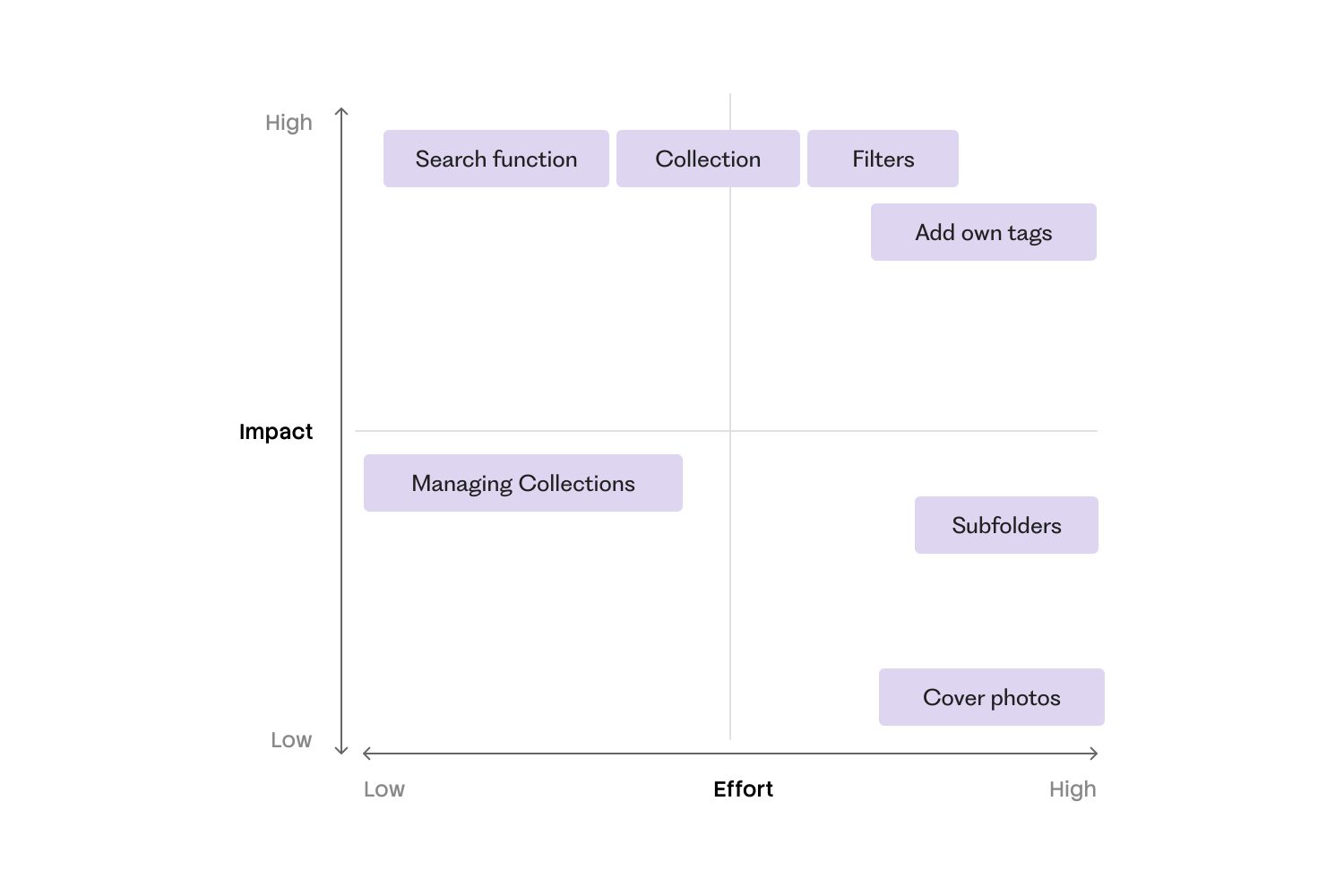
Search, collections, filter/sort and labels all came out of ideation, and building them at full complexity would have made testing uninterpretable — when everything changes at once, no reaction can be attributed to anything. An effort/impact grid put search, collections and filters first, labels just below, and parked subfolders, cover photos and collection management. Mobile-only throughout, since every interviewee used Twitter almost exclusively on their phone.
The easy word was “folders.” I chose “Collections” for what it implies before anyone taps.
Folders suggest a tweet gets moved and filed away; collections suggest grouping, where a tweet sits in more than one place and still lives in the main list. Same feature, different mental model — though testing later pushed me to a folder icon, and X shipped this calling them folders. I’d still defend the word. I never tested it.
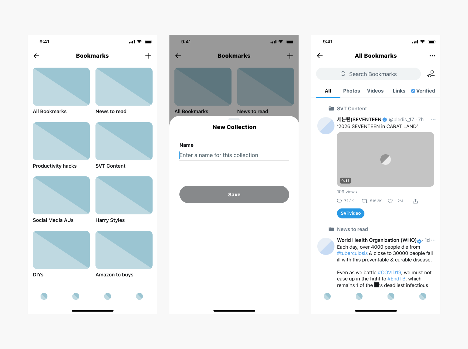
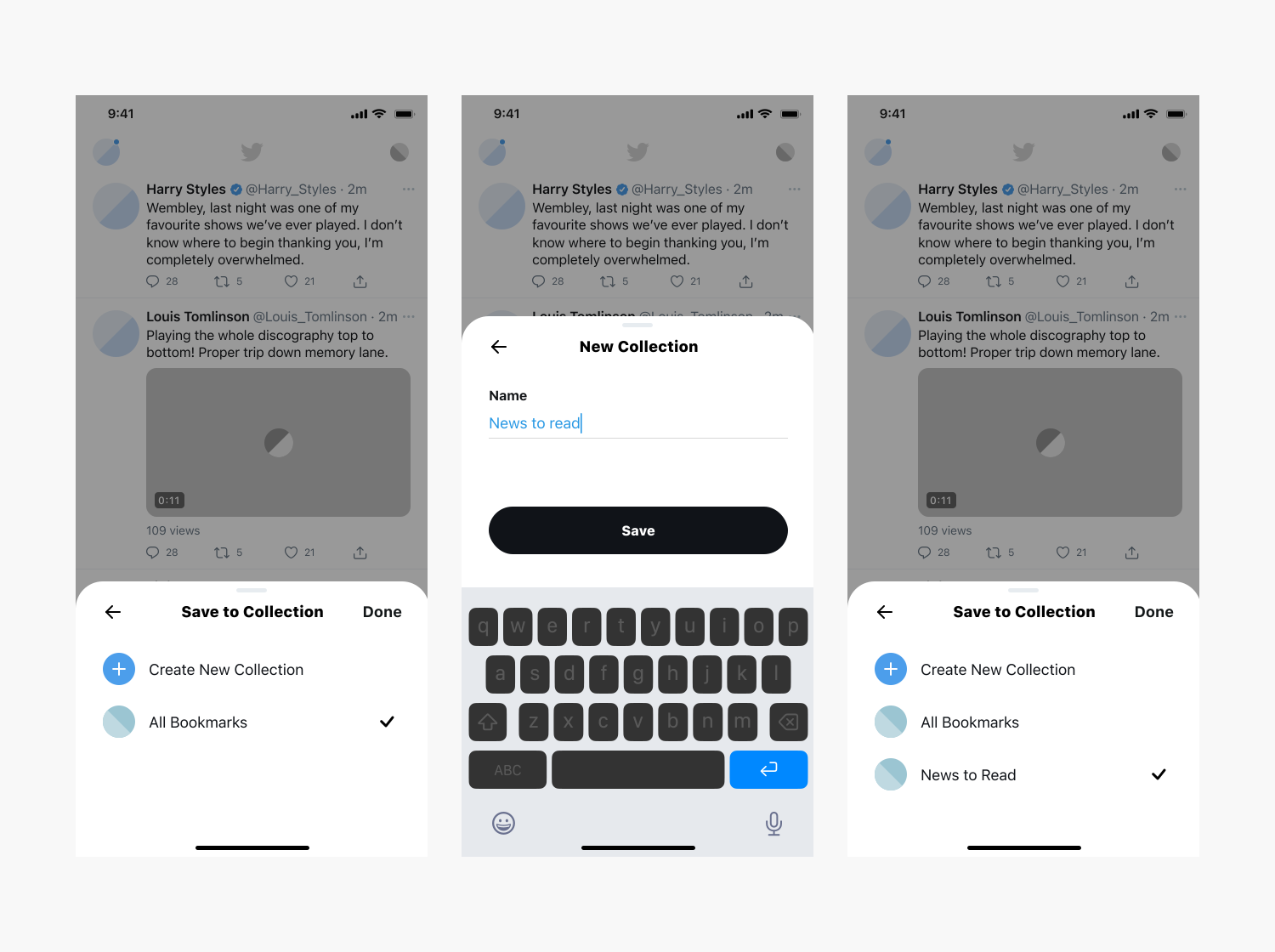
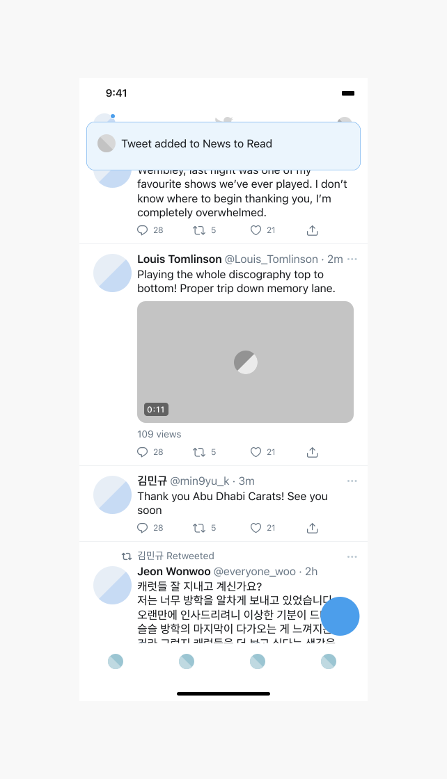
Users get asked to organise exactly once — at the moment of saving.
Interviews were unambiguous that nobody goes back to tidy up later, so the save action itself asks where, with the option to create a collection inline. It’s also why “All Bookmarks” stayed pinned to the top of the hub: someone who organises nothing still has to land somewhere useful.
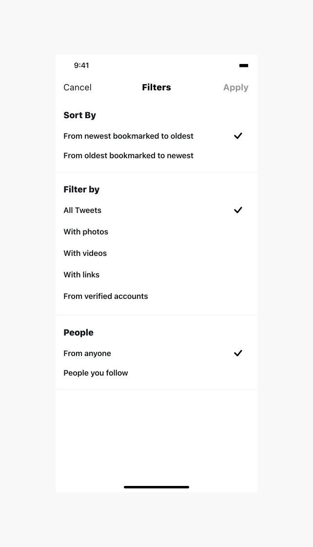
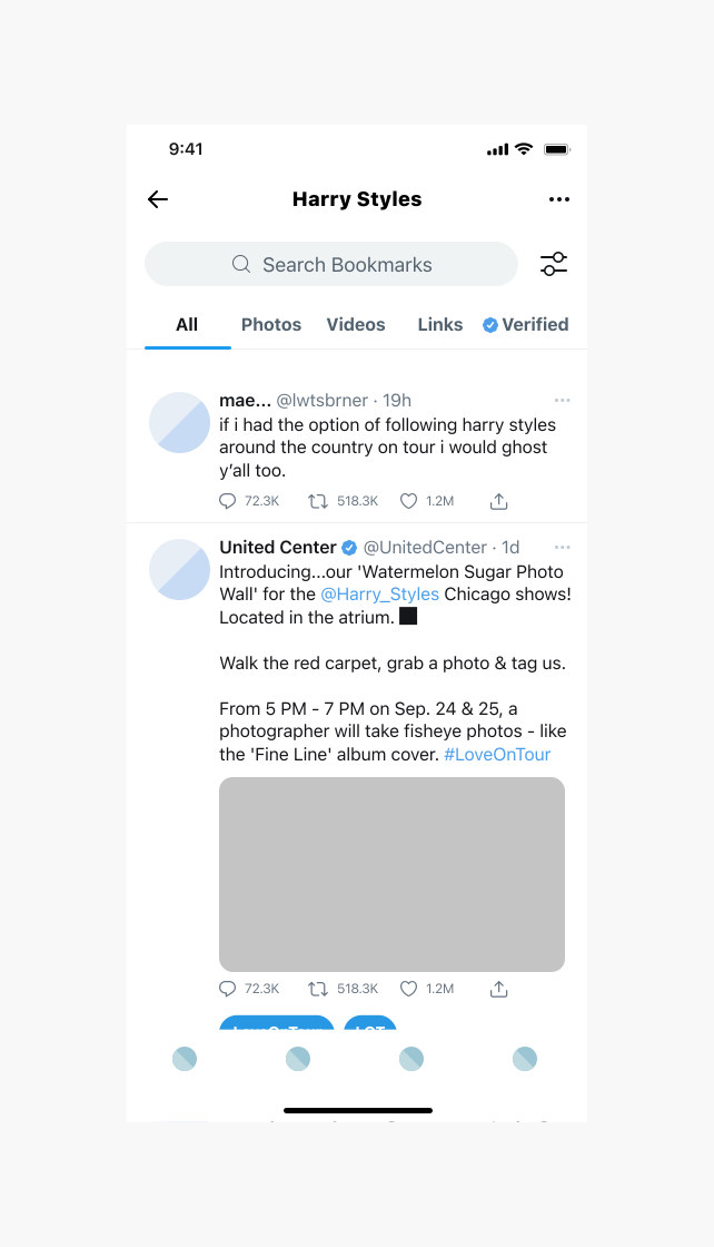
All four testers understood the filter icon but none of them wanted to use it.
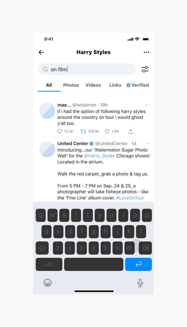
V1 put filters behind an icon — the conventional mobile pattern, and nobody was confused by it. They just weren’t going to tap it. One put it better than my rationale had: “people are lazy. They would not tap on the filter to discover its functions.” Twitter already surfaces filters as tabs in its own search results; I’d reached for the generic convention while the platform’s own pattern sat one screen away. V2 moved them onto the screen as tabs.
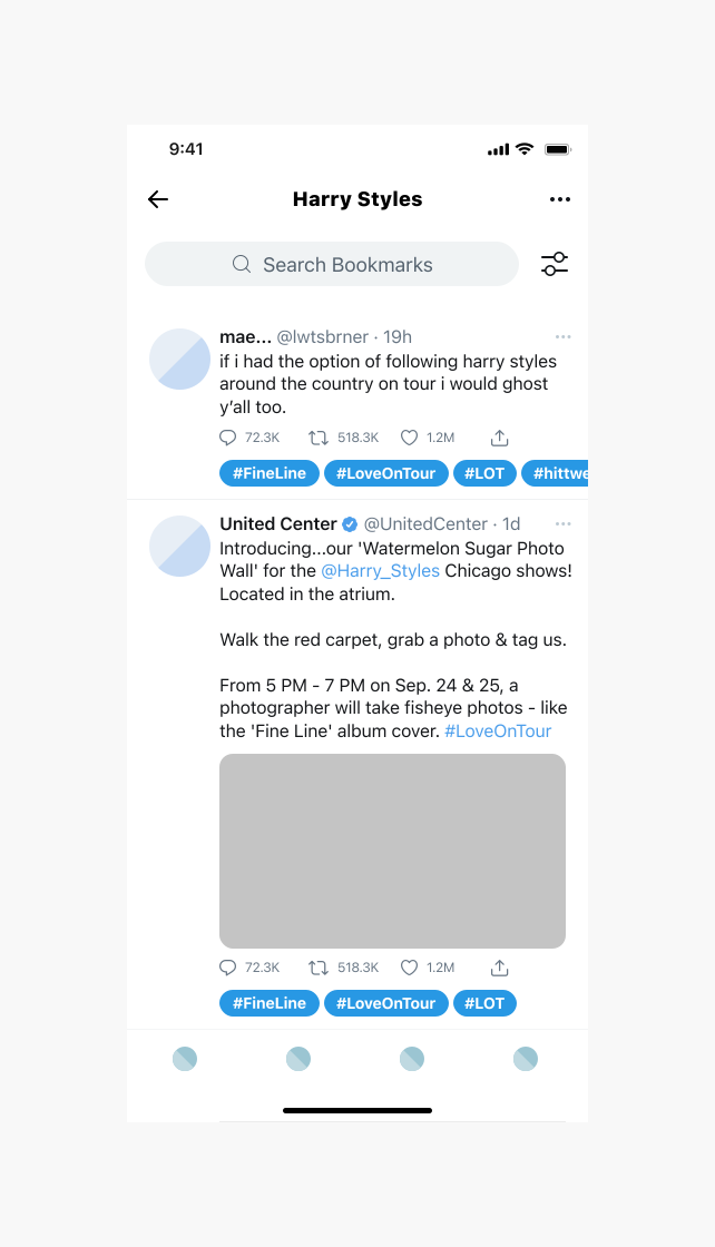
I called the labelling feature “Add Your Own Hashtags.” 0/4 understood it.
One thought they were tagging publicly, another assumed they were adding real hashtags, a third diagnosed it on the spot: “hashtag has its own universe already. Maybe name it as label?” The word was doing damage before anyone tapped anything — yet all four completed the task and called the feature useful once they’d used it. The idea was fine. The word was the failure.
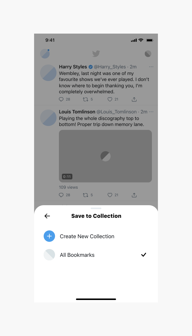
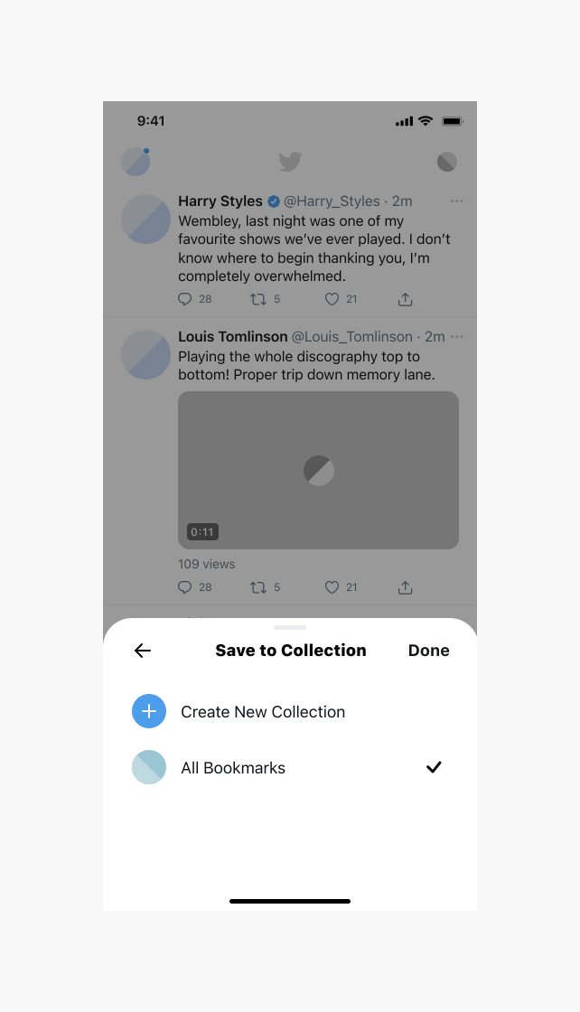
Every tester got stuck on the exit and they all said they didn’t need the fix.
After saving to a collection, all four tapped the collection name again rather than the overlay, re-triggering their own selection. When asked about it directly, 4/4 said a “Done” button wasn’t necessary for them, but that it would be nice for new users. One went further and questioned the test itself: he was on a desktop running a mobile prototype, and “if I’m using a real mobile, it’ll be intuitive to just click out.” I added the CTA on their reasoning, not mine — it costs one element and serves the first-time case they’d identified. Part of what I measured there was my test setup, so I’d want a round on real devices before calling it a finding.
Testing outcomes
This project had six activities, four participants, 93% task completion and five things that came back for revision.
Here are some feedbacks from the participants:
It feels like this is spoonfed. You’re like a spoiled user. It’s really easy even if you’re a new user.
I appreciated the whole thing because the fact that you can group them is very helpful already. I use Twitter on a daily basis so I can tell if there are features that needs improvement.
The number I’d point to isn’t the 93%. It’s that every V1→V2 change came from watching what testers did rather than from my own second-guessing: the filter pattern, the feature name, the exit affordance, and two signifier fixes I’d have defended if nobody had checked.
If this shipped
Prototype testing only tells you so much. This was a concept project, so the results come from six moderated activities with four participants, not real-world usage.
Task completion tells me people could do the thing. It doesn’t tell me whether the feature changed behaviour. What I’d want to track:
Time from opening Bookmarks to reaching a specific saved tweet
Percentage of bookmarks that ever get filed into a collection
Whether “All Bookmarks” stays the primary view or collections take over
Return rate to saved tweets — the real measure of whether the promise is being kept
Uptake of labels, and whether labelled tweets get retrieved more often
Drop-off in third-party tool usage among heavy bookmarkers
The question I’d most want answered: do people start bookmarking differently once they trust they can find things again?
Learnings
Naming is a design decision, not a copy pass.
“Add Your Own Hashtags” sent 4/4 people down the wrong mental model while the feature underneath tested fine — any word borrowed from an established platform pattern imports that pattern’s full meaning, whether you want it or not.
Comprehension isn’t adoption.
Every tester could explain the filter icon and every tester wanted it replaced; had I tested only for “do they get it”, I’d have shipped a control everyone understood and nobody would open.
When people build workarounds, the gap is already proven.
Dewey and Pocket existed because native Bookmarks stopped at saving — finding them in research set the benchmark for how far this had to go to be worth using at all.